Architecture, Globalization, and Local Cultural Identity
Architecture, at its best, embodies a society’s consciousness about itself. More perhaps than the product of any other discipline – any of the arts, science, or technology-the artifacts which result from the act of building bespeak the character and aspirations of their makers. Architecture is our most timeless and quotidian means of expressing ourselves – of transferring ideas and values.
Buildings inherently and unavoidably document the everyday life of a culture. They are repositories of the patterns of activity, association and movement of a society or people. Just as the Romans embedded in the city of Pompeii a treasure-trove of information that could be unearthed centuries later, so our current buildings and cities document contemporary life and attitudes. They do so in fundamental and everyday handling of land use, densities, building type development, plan configurations, and hierarchy of functions. But buildings also document contemporary life in more expressive ways that speak of the technological, social, and artistic values of a culture-its conservativism, adventuresomeness, intellectual capacity, emotional depth, farsightedness, ambition inventiveness, etc.
For me, urban design and building design are pursuits which involve a mining of everyday life in a particular culture for perceptions and messages about its values, ambitions, and future. Architecture and city-building must address particulars of place and culture. They must be firmly rooted in the tangible realities of their situation-the history, climate, geography, economy, technology, human behavior, and cultural life of their place. When distracted by an inordinate preoccupation with artistry or style, architecture becomes flaccid, generic, and far less powerful as a cultural force.
It is easy to admire vernacular examples of environments deeply rooted in local culture. The poignant expressiveness of a New England village, a Rocky Mountain mining town, or a Southwest desert pueblo demonstrate real, tangible physical and societal diversity. Neighborhoods, towns, and regions that have held onto their authentic identities attract us by their toughness and individualism.
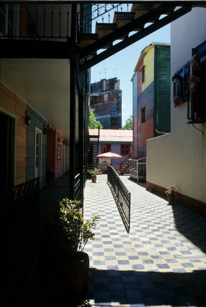
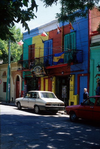
The little neighborhood of La Boca in Buenos Aires overtly proclaims its independent identity from the rest of its metropolitan region. Inextricably linked to the River Plate in a city that otherwise turns away from its river and port, “La Boca” (“the mouth of the river”) grew up as a proud, working class Genovese neighborhood. Its ethnic roots (solidly Italian ) as well as its industrial base (sailing, shipping, and boat-building and repair) created a strong identity early. Its development of a unique strain of tango and its breeding of one of the preeminent soccer teams in the world added layers of particularity. The physical environment of La Boca embodies and reinforces its cultural identity. Inhabitants made their homes our of sheet metal just as if they were building ships out of the same materials. Impoverished locals begged excess paint from incoming ships and local repair shops, which they applied in a wild, unfettered way that expressed their raucous, exuberant way of living. The passion of their community, expressed in other ways as a romantic tango or a fanatical loyalty to local soccer deities, is palpable in its physical environment.
MODERNITY AND CULTURAL IDENTITY
One of the great contributions of modernism to the advancement of architecture came in its attentiveness to tangible realities and its rejection of artistic style. Louis Sullivan, the great American architectural pioneer, stated these early modern notions well at the beginning of the 20th entury when he wrote, “Nothing more clearly reflects the status and the tendencies of a people than the character of its buildings. They are emanations of the people; they visualize for us the soul of our people.” Sullivan considered architecture to be a social and political medium capable of expressing ideals and values. He proclaimed, “To discuss architecture as the projected life of a people is a serious business. It removes architectural thought from a petty domain and places it where it belongs, an inseparable part of the history of civilization.”
The role Sullivan sought for architecture was not just a medium for reflecting longstanding culture, but an activist ingredient in seeking and provoking cultural progress. He was especially interested in architecture’s role in helping to formulate American culture. He observed, “The spirit of democracy is a function seeking expression in organized social form… Our self-imposed task is thus to seek out the simple: to find broad explanations, satisfying solutions, reliable answers to those questions which affect the health and growth of that democracy under whose banner we live and hope.” In particular, Sullivan sought out an architecture which expressed his own place-a “Chicagoey” architecture one with “western frankness, directness- crudity if you will.” Modern architecture as Sullivan proclaimed it to his young colleague in Kindergarten Chats would be, “a beautiful, a sane, a logical, a human living art of your day; an art of and for democracy, an art of and for the American people of your time.”
These early modern notions found fruition in the work of many prominent 20th century architects but are perhaps most poignant in the work of designers who focused on eliciting a very strong sense of place in their work – architects like Frank Lloyd Wright, Alvar Aalto, Luis Barragan, and Louis Kahn. Informed by landscape, geography, climate, and local materials, and inspired by a careful observance of vernacular construction, these architects built, as Sullivan instructed, for the people and culture of their own time. Their work is fresh and inventive, but also is a very particular reflection of local culture.
FRANK LLOYD WRIGHT AND AN ARCHITECTURE OF LOCALITY
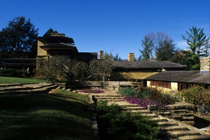
Wright learned Sullivan’s lessons at the feet of the master himself. He too sought an American architecture and, particularly in his early career, an architecture for the emergent American Midwest. The Prairie Style house grew from its own native soil. Wright said, “I was born an American child of the ground and of space …. I loved the prairie by instinct.” His own home, Taliesin North, is all about embodying the rural life of Midwestern America. As Thomas Beeby has written in his meticulous analysis of the complex, Taliesin North is an extension of the geological and topographical forms of the region. Its dominant horizontality connects it to the broad, low sweep of the prairie. Its modest tower is a reflection of the unusual stone outcroppings which characterize this oddly unglaciated region. The complex is made of the local ledge-stone in combination with the ubiquitous American wood frame. It learns from-but significantly advances-the rural farm vernacular of its environment.
This and other of Frank Lloyd Wright’s houses of the first quarter of the 20th century were intended to portray the best of contemporary life and values of the American heartland. They were free-standing and individual. They exemplified self – sufficiency and democracy. They were unaffected, sincere, and honest. Wright’s hero, Ralph Waldo Emerson, wrote essays on the values and ideals of his culture. Wright built embodiments of the values and ideals of his place and time.
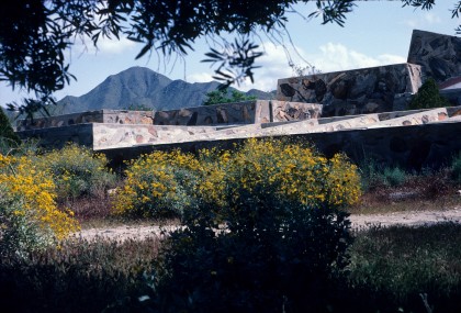
The extent to which Wright relied on inspiration from the particulars of the place and culture where he was working to stimulate his inventiveness is evident in the extraordinary contrast between the home and studio he built for himself at Taliesin North in Wisconsin and the later compound he created for similar purposes at Taliesin West in Arizona. In the latter case, Wright is provoked by characteristics of the desert – its ruggedness, its flatness, its colors and textures. There is a radically different feeling than at Taliesin North. The Arizona colony even recalls literal vernacular building traditions of the region. The flat roofs, stepped terraces, and low, heavy walls made of stone gathered from the site all recall Pueblo construction. The buildings at Taliesin West are recessed into the ground at times like early settlers’ dugouts in the region. Elsewhere, portions of the complex hover thin and light above the flatness of the desert like itinerate Native American tents. The ensemble is new, fresh, and vigorous – a real advance for Wright. But it is also bound timelessly to its place.
At almost every level, Wright’s projects in Wisconsin and Arizona reflect a poignant sensitivity to local building and culture. Taliesin West is all about shade from the sun, catching breezes, being outdoors much of the time, and reveling in the starkness and ruggedness inherent in the landscape. There is a lifestyle and body of cultural values embedded in the buildings that Wright adopted from the desert and its inhabitants. Taliesin North, by contrast, is all about drawing the precious winter light indoors, creating sunny, outdoor spaces protected against the north winds, and enjoying the soft green character of the landscape during warmer seasons of the year. There is a gentleness and civility that is very rural and Midwestern. The complex is clearly rooted in its agricultural culture and landscape with functional outbuildings oriented to crop cultivation.
Wright’s modernism was not about a universal set of forms or techniques. It was not just a new style. It was about responding to the tangible realities of a situation. It was, in Sullivan’s words, “serious business” which required being “sane” and “logical” in order to create “satisfying solutions” and “reliable answers.” Wright, at his best, was capable of addressing a place like Wisconsin or Arizona and making magic of the elements he found there- elements that might have been overlooked or undervalued by other designers for generations. Whereas many architects would have written off both regions as having little or no substantial form-giving impetus to relate to, Wright discovered the latent potential even in contexts that seemed to be unpromising.
ALVAR AALTO – CAPTURING A SENSE OF FINLAND
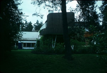
Wright’s talent is akin to something Alvar Aalto noted as “the gift of seeing the beautiful in everything.” Like Wright, Aalto often built in places that did not possess a strong, cohesive architectural heritage. Yet he felt a genuine desire to draw on the very best qualities he could discover in whatever place he was working. In his earliest projects, this inclination took the form of capable reliance on both the Finnish rural vernacular of simple board and batten volumes and the Leningrad-inspired Neo-Classical vocabulary established by C. L. Engel in the early 19th century in Finland.
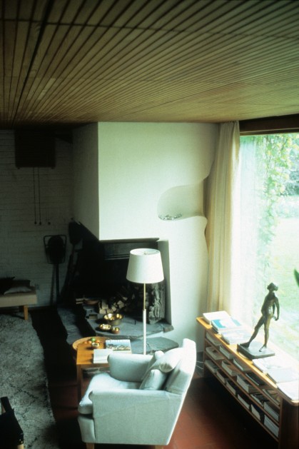
By mid-career, however, Aalto was capable of a much richer and more appropriate regional expression that brought together more synoptically “the beautiful in everything” in Finland. The Villa Mairea of 1939 is, like Wright’s work at Taliesin North and Taliesin West, an extraordinary response to the tangible realities of its place and a landmark work of modern architecture. The spacious rural home built for a prominent Finnish industrialist family is part Nordic sod-roofed hut, part vernacular log cabin with gutters hewn from tree trunks, part reinterpreted board-and-batten-clad farmhouse. But it is also part Scandinavian Functionalism that had developed quickly in the decade of the 1930s and part new industrial Finland, with its rapidly developing wood-products and ceramics manufacturing.
The Villa Mairea is crafty, rugged, and relaxed like the landscape and building traditions of Finland, but it is also orderly, clean, and precise like the mindset and culture of Finland. The regionalism in this instance is not a one-liner. It draws on the climate, the shapes in local topography, and the colors and textures of the landscape, as well as on lifestyles and social customs. The integration of sauna and dipping pool in the heart of the building ensemble, as well a s the creation of an almost-enclosed court around which various functions gather, ground the daily life of the home firmly in Finland. Aalto invented a fresh new regionalism – not a style, but a carefully crafted sensibility for building in his place.
LUIS BARRAGAN – A MODERN MEXICAN EXPRESSION…
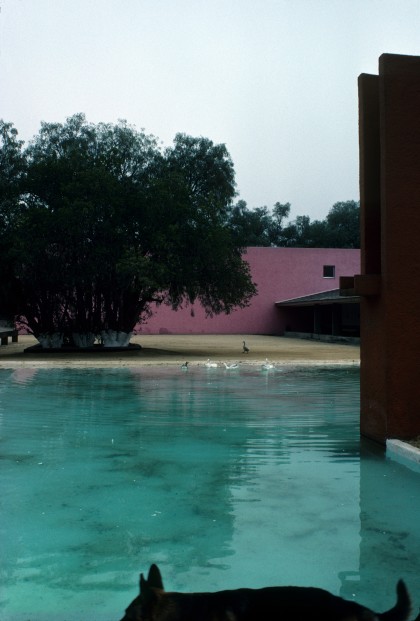
Concurrent with Alvar Aalto’s development of his regional sensibility in Finland Luis Barragan was pursuing a similar search for an appropriate regional expression for a very different landscape, climate, and culture in Mexico. His accomplishments are comparable to Aalto’s. Barragan loved Mexico in much the same way Aalto loved Finland. He was devotedly Mexican, refusing to work elsewhere even when tantalizing commissions were offered. He knew Mexican vernacular building instinctively from his childhood and deeply felt its strength and potency. He had an educated appreciation for Mexican religion, painting, and literature. He tapped these deep-seated resources in creating his extraordinary architecture.
Barragan’s memorable fountains evoke images of the wood aqueducts that spanned the courtyards and passageways of the village of Mazamitla that he knew from his childhood. His walls draw on the ubiquitous Mexican traditions of masonry building in addition to the common Mexican convention of creating rigorous spatial distinctions between public and private realms. His signature vibrant colors are not only rooted in the brilliant hues of the everyday urban scene in so much of Mexico, but are also refined by the studious experimentation with color of Mexican artists like Rufino Tamayo and Barragan’s close friend and collaborator Chucho Reyes. Even the construction technology of Barragan’s buildings frequently relies on methods of traditional construction common in vernacular pueblos and haciendas.
But Barragan’s work is also tied to the 20th-century fervor in Mexico for modernity. Barragan, like most of his contemporaries in the 1930s had a subsuming love affair with Le Corbusier’s emerging vocabulary of the period. His later work validates the legitimacy of these early influences, but puts them in proper perspective. Barragan’s modernism welcomes the evolution that comes of incorporating the interests of each new generation into longstanding cultural traditions.
LOUIS I. KAHN – BUILDING WITH A STRONG SENSE OF PLACE
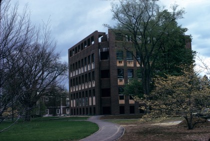
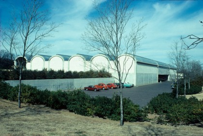
The closest parallel to this fresh new regionalism in the modern era in the United States is the late work of Louis 1. Kahn. Two of the last buildings he finished before his death make the point very strongly. His Exeter Library in New Hampshire is chaste, subtle, and reserved on the outside – a quintessential New England building. It is deferential, even acquiescent, in its campus context. Its simple stereometric volume pierced by a regular pattern of repetitive wood windows, its taut red brick envelope, its vertical hierarchy from massive and robust at the base to delicate and diminished at the top all position it easily within the longstanding building traditions of New England. The Kimbell Art Museum in Fort Worth, Texas, of exactly the same period, is as strikingly different from Exeter Library as, in fact, north central Texas is different from southeastern New Hampshire. Again, Kahn relies heavily in the Kimbell Museum on regional inspiration. The broad horizontality of the north Texas prairie is reflected in the low, flat character of the building. At the front is the familiar Texas porch that also serves to introduce and explain the building’s carefully articulated spatial and structural system.
To anyone familiar with the area, the long concrete vaults that are the units from which the building is composed draw an easy parallel to the cylindrical concrete grain elevators that are landmarks throughout the city and the surrounding region. Kay Kimbell, who was the benefactor of the museum, made his early fortune, in fact, in grain. But, horizontal as these features are, they are a closer parallel still to the bow-topped stock barns that stand in regular ranks just a few blocks from the museum and are typical of the galvanized metal industrial vernacular of the region.
Kahn is not just sampling eclectically from forms he observed along the highway driving from the airport. He demonstrates a real and profound feeling for Texas-particularly in his handling of light, color, and texture. The tawny tans and grays of the building are reminiscent of the colors of the native landscape, with its limestone substrata and parched grasses. The tactile quality of the building’s materials gain even greater character when placed in deep relief by the harsh Texas sun. Everywhere, light and shadow are modulated with great understanding and finesse. The building is truly resonant in its place.
All four of these architects – Wright, Aalto, Barragan, and Kahn-stand among the most significant innovators and form-givers of the modern era. The inspiration for that innovation and form-making is significantly from local conditions and culture. Our understanding of that origin is frequently clouded by the fact that architecture is so often delivered to us through media severed from its cultural ties. It is hard to truly understand the rootedness of Wright, Aalto, Barragan, and Kahn by a handful of closely cropped images with little real knowledge of Wisconsin, Arizona, Finland, Mexico, New England, or Texas. The reality is most clear when you are there, experiencing a building as a tangible artifact in and of its culture.
A CONTEMPORARY PRACTICE EMPHASIZING LOCALITY
In our own work over the last 25 years, we have made a concerted effort to research and understand the culture and character of the places where we work and to use that knowledge to in spire design directions. We believe that varied local cultures are indeed alive and thriving across the United States and all over the world. Though conventional wisdom seems to say that advances in transportation, communication, and media in the 20th century have tended to homogenize culture, our observations tend to indicate the opposite in some ways.
As people become more mobile they are able to select what city or region they want to inhabit. People who love the outdoors and active recreation choose places like Colorado or Wyoming. People who like theater and opera flock to New York or Los Angeles. Individuals who thrive on following big-league sports teams choose cities where that is a focus. Those with an intellectual bent may prefer a college town. The point is that, more and more, people are not stuck living where they were born but have options to congregate with like-minded people in communities that really have something in common-that can create a meaningful culture out of shared identity.
Indianapolis, which was once dubbed “India-no-place,” has, in the last decades, developed a strong cultural identity around sports and athletics. Nashville, once a very sleepy southern town, has recently emerged as a powerful center for the entertainment and recording industry grown from roots in country and western music. Portland, Miami, Tucson, Raleigh-Durham, Salt Lake City, Boulder, Austin, and Seattle have all created strong new cultural identities for themselves in recent years and have joined San Francisco, New Orleans, San Antonio, Boston, and New York as American cities with a real uniqueness and local character. Young people flock to these cities with a very strong sense of who they are and what they want in a community to sustain them. They are rewarded by finding economic, social, political, lifestyle, and entertainment options that suit them.
Unfortunately, to date, the physical environments of American cities have failed to reflect this genuine diversity of culture and context as much as they might have. Generic stylistic trends seem to formulate architectural character more than tangible realities such as local climate, geography, technology, values, and lifestyles. In our practice we have tried to adopt modern principles of responsive, analytical, logical, and particular design to create architecture firmly rooted in its place and culture.
The physical environment can be a potent mechanism for investing identity and a sense of rootedness. The German term heimat, sometimes inadequately translated into English with words like “homeplace” or “homeland,” describes a notion of attachment to a place – a psychological bond which can be both nurturing and stimulating. If local cultural identities built around shared values and common predilections can be reinforced by this kind of psychological bond to a meaningful physical environment, a true sense of community can grow.
Much has been written about the negative effects of a kind of neutralizing globalization that has occurred in both political and economic realms in recent decades. Rebellion against loss of local ethnicity, religion, cultural practices, and beliefs has been swift and extreme in many parts of the world. But even outside the most dramatic of these rebellions, there has been a widespread and poignant sense of loss in instances where local food, local music, and local commerce, for instance, get obliterated by the massive corporate machines of globalization. Eric Schlosser, in his book Fast Food Nation, makes an excellent case for resistance to these forces. He makes it clear that it is not just the bland, superficially – appealing-but-unhealthy nature of the food that is destructive in the industries he investigates, but also the neutralizing impact on physical environments. Resistance can seem a daunting challenge, but Schlosser is encouraging in his most recent edition, observing some signs of very recent progress.
Architects have a responsibility to advocate for the creation of authentic and meaningful environments which support the cultures they serve. Doing so requires developing sensitivities and skills in reading and understanding particular cultures and places in much more than just a superficial manner. This may take the form of a long-term commitment to a place and culture as in the case of Luis Barragan’s life-long love affair with some particular aspects of Mexican life. But it can also take the form of the gimlet-eyed outsider’s view as in the case of Louis Kahn’s extraordinary perceptiveness about North Texas in the case of the Kimbell Museum.
We have been fortunate to be participants in the growing of an exciting local culture in Austin and Central Texas over the last several decades. It has been an exciting place to be and to practice architecture as a medium of cultural expression. We have fed on the insights of local writers, artists, and musicians. We have been activists in common causes with local politicians, arts advocates, and environmentalists. Our architecture is a subset of a larger commitment to helping our local culture become strong, independent, and assertive, propelling it to influence in the larger world.
In recent projects outside our region and our state we have sought to apply the sensibilities we learned at home to gain trenchant insight into the cultures of other places. This is a natural evolutionary step. Appreciating and valuing one’s own local culture does not mean being stymied or restricted by it. On the contrary, it opens one’s eyes to the nuances and particularities of any other place when traveling or working in a new environment.
FOUR HOUSES IN CENTRAL TEXAS
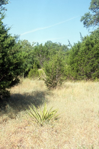
In America, historically, there is perhaps no building type so emblematic of our local cultures as the single-family house. Though it has generated some significant urban challenges, it has also contributed a way of life that can be warm, rich, individual, and closely connected to nature. In Central Texas, where the natural environment has great strength and beauty, the possibilities for a single-family house inextricably interwoven with the landscape are particularly powerful. There are, among the current generation inhabiting this region, a significant subset who appreciate deeply the land and its beauty-who understand how a whole lifestyle can be built around an integration of everyday activities inside and outside in this bold, varied terrain and climate.
As disparate sources as Lady Bird Johnson and the “hippie” counterculture movement of the 1960s began focusing attention on the value of the Central Texas landscape in the 1970s. Seen as an antidote to the rampant generic urbanization of Houston or Dallas, Austin and the region around it seemed to offer an alternative based in a genuinely divergent lifestyle as well as in the hills, creeks, bluffs, draws, and vegetation of its unusual geological circumstance.
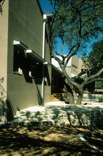
These four houses were all done for clients who loved the Central Texas landscape and who drew from it and from other cultural sources a way of living that was particular to its place. In each instance we worked together to create a house that would not be generic or replicable elsewhere. We tried to make real Central Texas houses that would seem odd or peculiar out of their context but would fit comfortably and amiably in their place. In their own modest way each of these houses protests the globalization of lifestyle, art, and economy. They reject mass marketing and the primacy of “resale value.” (Three of the four original clients still live in the houses 20 years later.) Outside their role in accommodating the lives of their inhabitants, these houses seek to explore what is interesting and distinguishing about this place and this culture. They revel in the crisp clear light of Central Texas with rich texture, color, and articulation. They tame the hot Texas sun with deep shady recesses varied logically and analytically according to orientation. They are generally strung linearly one-room-deep, perpendicular to prevailing breezes to optimize natural ventilation.
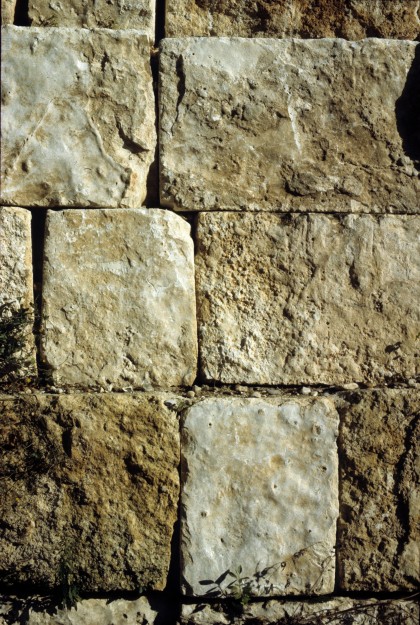
They are constructed of a mixture of old and new matenals – mostly locally produced. The ubiquitous Central Texas limestone is used generously, but not in a thin veneer as is predominantly the case in current practice. Stone walls here are built of two wyeths of masonry with an airspace filled with insulation between to create high thermal mass which contributes to keeping interiors cooler during the long Texas summers. Reinforced concrete is often integrated with the stone when a more demanding structural situation requires. Louis Kahn called concrete “liquid stone,” and it is used here with the limestone as a sister masonry material. Cement plaster or cement panels extend this masonry vocabulary to lighter, thinner walls.
Galvanized sheet metal and, occasionally, wood siding round out the palette of exterior materials. The thinness of the metal allows it to reflect heat without transferring it into the building. Its ductile nature enables it to take looser, freer forms than other, more rigid and brittle materials. Wood siding is used in a straightforward manner as a sensible sheathing for balloon frame construction. It is treated to weather naturally to a dark gray-brown.
Because stone, concrete, cement plaster, sheet metal, and wood have a history of sophisticated use in the region, there are craftspersons who can handle them skillfully. None of these four houses had large budgets. They were generally not built by the “premier contractors” who specialize in high-end custom homes. They were built simply and economically utilizing skills available in the local workforce. These houses were intended to be a kind of modern vernacular-rooted, particular, responsive, and accessible.
THE BURNET RANCH HOUSE
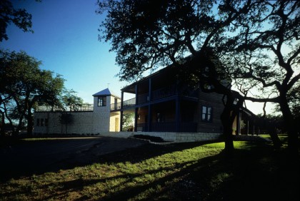
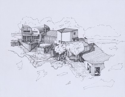
The Burnet Ranch House was designed for a young family of four on a working sheep and goat ranch outside Burnet, Texas. The parents were well-educated individuals who had traveled widely and lived in many different parts of the world. Their decision to live in this rural setting bucked conventional wisdom for sophisticated people of their generation. Their love of the land and the nurture they drew from it, however, compensated for the loss of urban culture. They had owned the ranch for several years before building a house there, placing the establishment of barns and service infrastructure as well as the planting of a pecan grove as a higher priority. The site reserved for the house had commanding views of the ranch in every direction.
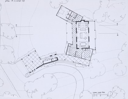
The house is very much about being on the ranch – enveloped by its peacefulness and reliable rhythms of daily life. More a compound than a building, the house is an agglomeration of five small interconnected pieces – each taking its character from the particular functions within, and the orientation to external views, sun, and breezes. A central wood-clad, two-story element marks the terminus of the winding ranch road approach and enfronts a pond below. It houses the entry and a very large kitchen designed as much for conversation as for cooking below and the two children’s bedrooms above. Its deep double-decker porch catches southeast breezes off the pond and extends all of its functions into the outdoors.
To the south of the central element are a stone volume (housing a washroom for cleanup coming back from the barn on the lower floor and playroom off the children’s porch above) as well as a carport which can double as a place for outdoor entertaining. To the west of the central pavilion is a tall single-story volume which houses a single grand room designed to be the internal focus of the house. Views from this wing are oriented north through a deep summer porch, toward the rugged hills of the ranch’s grazing lands, and south through a gallery and winter porch, which opens onto an outdoor court. (The house has almost the same number of square feet devoted to porches as to indoor spaces.) The fifth and westernmost building element is a wood-clad volume housing the master bedroom and bath. Its angle closes the outdoor court spatially and shields it from the western sun. The Burnet Ranch House grows out of its local culture and place but it’s also very cognizant of the culture in its time. An article published in Progressive Architecture shortly after its completion observed: “[the Burnet Ranch House’s] deliberate dissonance, a helter-skelter jamming together of things … bespeaks the late 20th century while acknowledging the particularities of function and site.” The building weaves together issues of land conservation, sustenance of rural lifestyle, and sustainability, which have not only strong local resonance but broader implications as well.
THE RANCH HOUSE ON WIMBERLEY, TEXAS
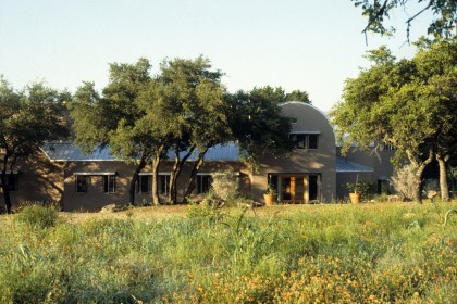
The Ranch House in Wimberley, Texas, is situated, like the Burnet Ranch House, on a plat of several hundred acres. The house site is on a high bluff shaped like a bowl above the Blanco River – one of the most scenic waterways in the region. It creates an edge between the high flatter part of the ranch to the north and the soft green gorge of the river, lined with huge cypress and live oak trees, to the south. The rooms of the house are strung in a bow to embrace the bowl-shape of the land and to orient views directly toward the river.
Two barrel-vaulted bedroom suites cant slightly south east to catch prevailing breezes more directly. They each combine a bathroom, closet, and sitting room, dominated by a stone fireplace below and with a sleeping loft above. The sitting rooms spill directly out to a large shared terrace shaded by existing trees. From the sleeping area there is a powerful connection both horizontally and vertically from river, to bluff, to terrace, to sitting room, to loft, to ranchland. The vertical volume of the suites draws cool air up from the shady riverbed and ventilates it out the top of the vault so that the rooms are generally pleasant without air conditioning even on a very hot day. Metal eyebrows cover all operable windows so they can be left open even when it rains.
At the opposite end of the house from the bedroom suites is a very large kitchen designed for several people cooking together and for occasionally feeding large groups. (For a while the kitchen was home to a notable local cooking school.) It is a dramatically tall space with a ceiling that slopes up in three directions to the exterior wall. The ceiling acts both as a light deflector, bringing’ soft generous light to work counters from high clerestory windows, and as a means of directing warm air from cooking up and out the operable openings. Just above counter height are generous windows that give views down to the river and direct cool breezes up from the river to counteract the heat generated in the kitchen.
Nestled between the taller bedroom suites at one end and the kitchen at the other is a long lower room housing living and dining functions. A continuous terrace links all three volumes on the river side, shaded by the canopy of live oaks as well as deep roof overhangs.
The local culture here is somewhat different than that of the Burnet Ranch House. Wimberley has become a kind of resort community with weekend homes for many Houstonians. Though this particular house has been the primary residence for its owners, it participates in a different kind of interaction with functions of the landscape. The ranch owners here had already begun to clear the land of invasive non-native vegetation and to restore indigenous grasses before the house was built. The scenic and ecological nature of the land is more important than its productivity. The Wimberley Ranch House revels in that scenic and experiential confluence with the land. It is about enjoying a well-prepared meal under the dappled light of a spring afternoon and feeling the soft breezes off the river caress your skin. It is about sophisticated sociability-having guests and entertaining. It is about good food, good wine, good conversation, and a setting that amplifies these everyday pleasures. The looseness, responsiveness, and authenticity of the architecture is an embodiment of a lifestyle and set of values generated by a memorable landscape and place.
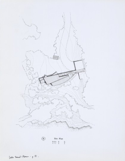
LAKE TRAVIS HOUSE
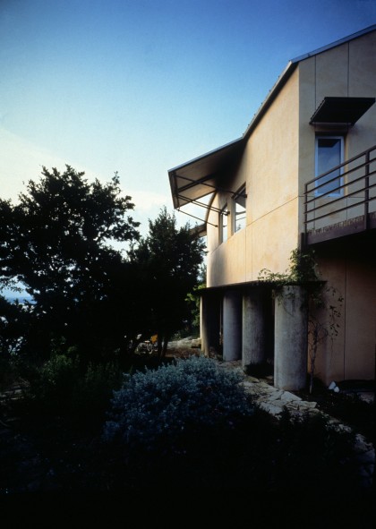
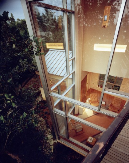
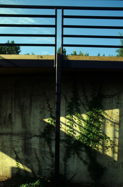
The Lake Travis House is a step more urban than the two previous ranch houses though it still sits on several acres of land oddly left out of the resort subdivisions that surround most of the man-made lake it enfronts. Perched on a bluff 100 feet above the water at Arkansas Bend in Lake Travis, the site commands extraordinary views to the southwest, west, and north. Acknowledging both the variety and panorama of the view potential, the west side of the house takes the form of a sweeping arc while the north views are captured in vertical, stepping rectilinear forms. Orientations of wall shapes and fenestration are matched to specific characteristics of various vistas. With so much orientation to the west, sun control is a dominant design factor. Detached concrete piers, horizontal wood trellises, deep awnings, and concealed automatic rolling shutters on the exterior provide very thorough control through the full range of seasons.
Like the two ranch houses, the Lake Travis House derives much of its identity from the landscape, climate, and other physical characteristics of its locale. Like the others as well, there is a social dimension that reflects the nature and values of the client as a subset of local culture. In this case, the couple who were clients for the house were early predictors for a kind of Central Texas habitue that would become prominent over the following two decades. The husband is a software consultant and the wife an environmental activist particularly interested in native plants. The couple and their two young sons could have lived pretty much anywhere since neither of them had jobs that required being in a particular location. They chose to live in Central Texas because they felt an empathy with the place, and, like thousands of others, their move to Austin reinforced the extant local culture.
The spatial organization of the Lake Travis House reinforces a lifestyle this family chose explicitly. They had purchased the land several years before they built the house, living in a very inadequate existing structure until they could afford to build. During that period they had studied every nuance of the land-where the sunset was most glorious at what time of year, which plants flowered and when, migration patterns of wildlife, etc. The house and its inhabitation of the land needed to reinforce the pleasure they gained from being in this place. Like the ranch houses, views and outdoor spaces became as important in terms of everyday function as interior spaces.
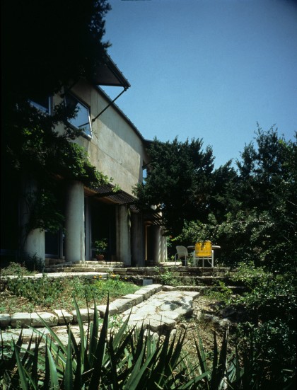
But there is also a pattern created in the interior rooms that reflected a particular emerging local culture. For this family, and many others like them moving to Central Texas, living, working, and raising children did not have discrete boundaries. Work hours and leisure time were not defined as separate. Much professional activity occurred at home – often in conjunction with child care. Domestic chores like laundry and cooking needed to be made easy and integral to other activities. The lower floor of the house responds to these characteristics by becoming an open series of spaces oriented to terraces and lake view, which have, at the center, a focus on cooking and eating. Child-centered spaces anchor the south end of the lower floor, while work-centered spaces anchor the north end. Upstairs, bathing (including an outdoor shower) and laundry become the hub in the center, with children’s bedrooms off a huge outdoor play area on the south end and master bedroom oriented to additional views to the north.
The Lake Travis House embodies, in a direct, unaffected way, the longstanding physical and emerging social culture of its place. It nestles gently into its site, shrouded by existing vegetation even though it sits in a prominent location high above the lake. The life lived within and around the house becomes a natural extension of life that has occurred there before. An old log hut remains comfortably near the house. A concrete bomb shelter from the 1950s is integrated into the carport and terraces. The house is a contemporary extension of the land and its occupation expressed logically, sensibly, and modestly.
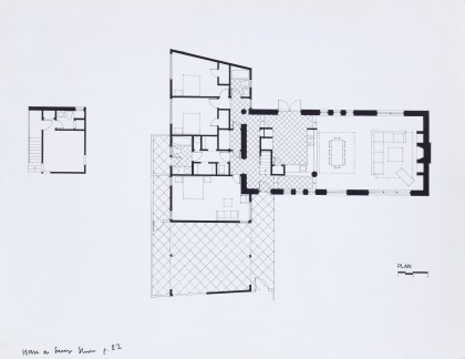
HOUSE ON SUNNY SLOPE DRIVE
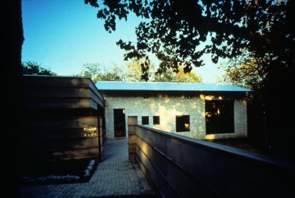
The fourth of these Central Texas houses completes a continuum from the fully agrarian Burnet Ranch House to a location on a small lot in a dense in-town community in Austin. The House on Sunny Slope Drive is located on a 75- by 90-foot lot in Tarrytown, a well-established mixed-use neighborhood just west of downtown and the University of Texas. The 2,300-square-foot house was placed deep on the back of the lot in order to combine the front yard (mandated by a required 25-foot setback) and what would have been a narrow backyard, into a single, more usable outdoor space. This larger front garden is shrouded from the street by a six-foot fence made of the same materials as the house.
Because the neighborhood has many different kinds and sizes of houses from many different eras, there is less consistency in terms of how houses address the street than in “built-at-once” suburbs. Even on little one-block-long Sunny Slope Drive there were wooden bungalows with big front porches, 1950s split-level ranchburgers, a two-story near-colonial, and even a very sophisticated 1960s modern brick and glass house surrounded by walled gardens. The wonderful, eclectic permissiveness of Tarrytown genuinely reflects the rich diversity of its inhabitants. There are cultural messages here that are powerful indicators of Austin as a community. The mixture of large houses and small houses, the intermingling of fairly well-off families with households of modest means, the integration of young families with older people who have spent most of their lives in the neighborhood, all contribute to making Tarrytown, along with six to eight other in-town neighborhoods, quintessentially expressive of Austin.
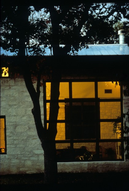
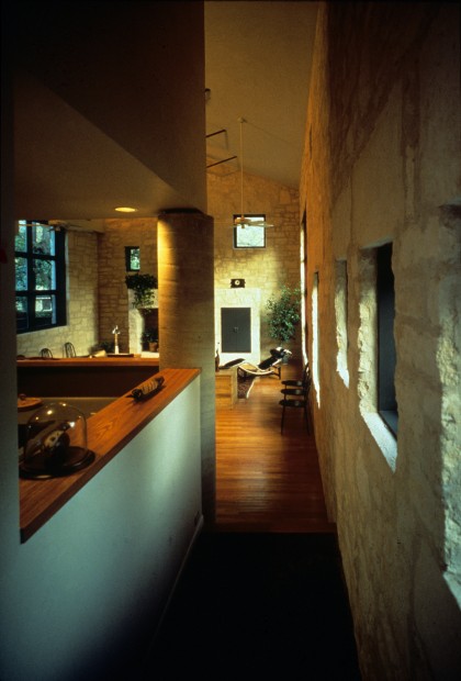
The decision to create a private garden in the front of the house fit naturally and comfortably into the character of the neighborhood providing, now that landscaping has grown fully, a kind of green interlude on the street. The house itself pretty much disappears. The interlude reinforces the freedom and variety of the street and the sense of diversity of the neighborhood. Its independence reflects one of the very best aspects of Austin culture – an appreciation for individuality and loose rules. (This is this same set of values that has fueled Austin’s eclectic live-music scene.) The primary wing of the house, tucked to the rear of the lot, is a simple rectangular volume made of 18-inch-thick stone walls housing living, dining, and kitchen functions as well as a small loft study. It is one big open room inside. The stone walls give a strong sense of privacy and protection, but large, strategically located openings give a sense of being intimately connected to the leafy understory of the trees outdoors as well. Even here in town, there is a sense of the toughness and ruggedness of Central Texas contrasted with the softness of shade and green. The openness of the room and its generous light as well as its textures, colors, and materials all tie it clearly to its place.
The south-facing front wall has a deep overhang created by an extension of the galvanized metal roof framed on exposed steel struts. This heroically scaled shading device works with the high thermal mass of the room inside its insulation to keep the space cool in the summer. Operable windows oriented for access to prevailing breezes and cross-ventilation further contribute to providing a temperate thermal environment with a minimum of mechanical support.
A secondary wing hugs the west side of the lot protecting the garden from late afternoon summer sun. It houses three bedrooms, two baths (one with an outdoor shower), and a “carporch.” The latter space is both a generous covered patio extending the outdoor room of the garden for entertaining and recreation, as well as a place to store the car under shelter when desired. Bringing the car into the house in a frank, unabashed way is natural and sensible in the context of the car culture inherent in any new American city. The car here is a comfortable, compatible element as integral as any other domestic machine.
The secondary wing and garden wall are made of horizontal strips of cement board – an industrial product more commonly used as form – liner in construction than as a finish material. Durable and easy to cut and work, the material has weathered beautifully through the years, creating a compatible, but differentiated character for the more modest parts of the house in comparison to the great stone room. The composite is, as Architectural Record noted at the time of the house’s completion, a building with “respect for Texas tradition” but also “a low-key modern house.” It is comfortably both of its place and time.
UMLAUF SCULPTURE GARDEN
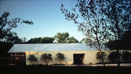
Located at the edge of Zilker Park, a sprawling urban oasis near downtown Austin, the Umlauf Sculpture Garden is a large, naturally landscaped precinct housing the work of sculptor Charles Umlauf. Probably the best-known Texas artist of his generation, Umlauf did large-scale works, primarily in bronze, which are well-suited to outdoor display. But he also worked in stone and wood and at a smaller scale which required an indoor gallery. The site sits at the base of a 50-foot-tall limestone bluff atop which is the home and studio where the sculptor lived and worked for more than 40 years.
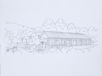
A building to accommodate the gallery and other support functions was located on a degraded portion of the site, which had been used for a landfill. This created an opportunity for site-repair as well as a chance to preserve the more scenic, wooded areas for gardens. The building was strung long and thin across the short dimension of the plat in an effort to define a small parking area at the south end of the site, completely shrouded from the gardens by the building. The gardens at the north end of the site would then be contained by the building on one end and the bluff with the artist’s compound on top at the other end.
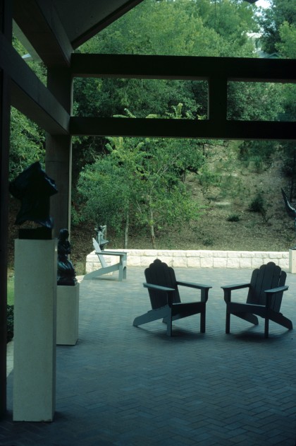
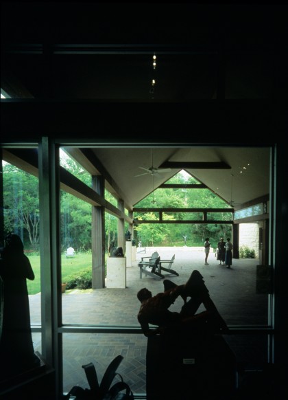
The gallery is composed of two distinct volumes. On the south side, a long, thin stone element with a wide sallyport puncturing its center creates a dramatic gateway leading from the parking area to the gardens. This volume contain s a small media room, library, rest rooms, and kitchen which require minimal exposure and act as “servant” spaces for the rest of the building. On the north side, an even longer open-frame volume houses both indoor and outdoor gallery spaces. A grand, generous porch comprises half this volume, receiving the sallyport on the south and opening out to the broad expanse of the gardens to the north.
As with the four houses, the Umlauf Sculpture Garden is fundamentally shaped, both in site-planning and building character, by qualities of the natural landscape. The solid limestone bar of the building parallels the dramatic limestone bluff behind it. The open frame of the gallery pavilion has similar qualities of space and light and vertical articulation to the densely canopied woods where the gardens are located. The north-facing glass wall of the interior gallery not only provides abundant, soft light for the sculpture within, but also connects the interior visual experience strongly to the landscape. The entire experience of the place is about being in the garden.
Consistent with this approach, the expression of the building itself is very quiet and understated. The volumes are generous and the north light is rich and warm. Its materials – limestone, weathered wood, clear anodized aluminum window frames, and a galvanized metal roof – are sympathetic with the colors, textures, and scale of the trees, the bluff, the tiny streambed, and the sky. The transition from road, to parking, to sally port, to porch, to terrace, to gardens, to bluff is a slow bleed from man-made to natural and from everyday urban life to a natural oasis in the heart of the city.
For many people in Austin, the Umlauf Sculpture Garden is in an iconic Austin place. Just a stone’s throw from Barton Springs Pool – the ultimate iconic Austin place – it seeks to share the same appreciation for the crisp air, big sky, hot sun, deep shade, lush green vegetation, and cool breezes that are so palpable in the pool precinct. The garden, and, in particular, the great porch in the gallery building, have been used for a wide variety of events that are important to remember. Political occasions, social events, weddings, and even a number of memorial services have been held on the porch because of its strong identity and sense of place.
There is a set of values, an attitude toward life, and a way of living in this instance that is particular to the local culture. The role of architecture here is not to create an art object or a representational image. It is rather to define a place where ritual and occupation become the focus – where life and culture are embodied in the character of the environment. It is the feeling and spirit of the place that are its most important qualities.
SULZER ORTHOPEDICS RESEARCH, OPERATIONS, AND PRODUCTION FACILITY
Essential to the “new” culture of Central Texas which has been developing over the last several decades has been the growth of high technology employers who have been drawn to the region by a well-educated workforce and a desirable “quality of life.” One such company is Sulzer Orthopedics, a biotechnology firm with Swiss ownership. Though this kind of semi-industrial facility is seldom thought to have significant “architectural potential,” this was a very exciting project for us. It offered an opportunity to take a generic, everyday building type which occurs on the outskirts of most American cities and see if we could “regionalize” it to Central Texas.
Sulzer, an international company relatively new to Austin, was anxious to make a building that “fit” there. They decried the image of the faceless multi-national corporation and relished the notion of a workplace that reflected the values of their local employees and the culture they were a part of. This was a chance to demonstrate that a corporation could participate in a global economy without contributing to the degradation of local culture and identity, which has been the byproduct of so much globalization. The Swiss owners, perhaps because of their own tiny country’s proud sense of identity, were very keen to build this large new facility with Central Texas clearly in mind.
The site chosen for the new building was in a new industrial park northeast of the city. Thankfully, though one road had been installed by a developer with great destruction to the landscape, Sulzer was able to acquire a large portion of the park for both immediate and expansion needs and to take it out of the developer’s control. The western half of the tract they acquired had some substantial trees- especially at the southern end. The eastern half was relatively flat and bald. A commitment was made to leave most of the western half as a preserve, with only a bit of executive and visitor parking woven among the trees, and to concentrate both immediate and future development where the landscape had already been cleared and grazed as pasture land.
The building was placed at a diagonal to the cardinal points allowing both northwest and southwest faces to look into the preserve. An L-shaped, two-story research and operations compound was placed on this side of the building. A one-story square-shaped production facility was nestled in the elbow of the L-shaped wings. A tall lightfilled “company street” created a bridge between the production facility on one side and research and operations spaces on the other. The goal was to create a common space where blue-collar and white-collar worlds mixed and where sales and management people could interact informally and naturally with scientists and production workers.
At the intersection of the two legs of the “company street,” a large cafeteria and meeting space provided a landmark and anchor. Its views out into the preserve in two directions and its double-height space linking the various parts of the company vertically as well as horizontally give it a distinctiveness that is almost civic.
The organizational patterns inside the Sulzer Orthopedics building are a blend of the way the company operated in general and a particular sense of how their company might best operate in the specific work context of Central Texas. An elaborate polling and interview process revealed a more integrated, less hierarchical attitude among the Austin group which found physical expression in the tight clustering of research, operations, and production together, and in the idea of the company street. A great desire for connections to outdoors for breaks and lunch resulted in a much more permeable building than usual with strong links especially to the most scenic parts of the site off the southwest face.
The architectural expression of the Sulzer Orthopedics building reflects both its internal organization and a strong responsiveness to the surrounding landscape. The two-story research and operations wings are simple, flexible loft spaces built of deep stone piers and concrete spandrels. They are repetitive and straightforward-tectonically simple and logical. The voids created by the piers and spandrels become very large 12-foot by 12-foot apertures giving dramatic vistas out to the preserve. There is nothing cloying or sentimental about these volumes. They are clearly industrial and technological. And yet there is a clear empathy with the land. The thicket of live oaks, native grasses, and prickly pears feel comfortable and compatible at their edges.
The double-height dining and meeting pavilion at the crossroads of the company streets contrasts with the research and operations wings by being much lighter and more delicate. A glittering jewel-box at night, it depicts the company as a whole rather than an agglomeration of parts. The single-story square of the production facility is sheathed in a carefully detailed corrugated metal skin befitting its role as industrial workhorse. The two legs of the company street, each with a slightly different section to avoid monotony, are more material-neutral so they can bridge together the other more material-specific building parts. They revel in the rhythm of movement and in the generous top-lighting from clerestory windows.
Sulzer Orthopedics demonstrates an attitude by which the wastelands of generic office and industrial parks which ring our cities could become rich, particular workplaces that contribute to local identity and sense of place. The composite effects of dozens of such facilities could be the retention of general native landscape character, a compatibility of buildings and landscape and far greater visual and environmental amenity in work environments. The budget for Sulzer Orthopedics was industry standard. Additional design character and environmental assets had to come from very simple, economical means. It is precisely in everyday economy-driven situations like this that design has great power to make a significant difference in our cities and in our lives.
ROUGH CREEK LODGE AND CONFERENCE CENTER
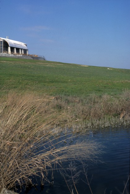
Our project for Rough Creek Lodge in Glen Rose, Texas, is a good example of a building substantially formulated as a response to natural and geographical conditions such as geology, landscape character, climate, materials characteristics, and environmental compatibility. The specific site for the complex was chosen as the most advantageous location for the required function on an 11,000-acre ranch in north-central Texas. The function to be accommodated was an executive retreat center – a place for respite and contemplation, but only an hour and a half drive from a major intercontinental airport.
The lodge occupies a high ridge with commanding views to a Y-shaped lake in the foreground and very long distant views enhanced by taller, shapely peaks beyond. There is a grove of now-mature live oak trees on the site, planted several generations ago. The buildings are strung long and low along the ridge, hugging the contours of the site. They are nestled in and around the trees so as to seem like a natural outgrowth of the ridge.
The view side of the site faces mostly north so that large expanses of glass could be oriented primarily in a direction where the sun is relatively benign. Most of the outdoor terrace space is located on the north side to catch the views but also so as to be in shade for much of the day, sheltered by the buildings from the hot Texas sun. Only a small lower-level winter patio and upper-level porch are located on the south side of the building, protected from winter winds from the north and open to deep penetration by the low winter sun. A pool and fitness center is slid around the ridge, bringing it out of view from any of the other buildings and giving it full sun exposure from all directions.
All private rooms are given the north distant view with circulation placed on the south side. All major function spaces-living room, dining room and meeting rooms – are likewise oriented north to ideal view and light. Auto access and circulation are tucked behind the buildings at the top of the ridge, separated from the lodge by a winding 650-foot-long stone wall. The wall is penetrated occasionally for gateways into the complex. It moves in and out between the existing oak trees, sometimes placing them as focal features in the patios along the circulation route.
Building massing, shape, and even function locations are driven substantially by the landscape and the geography of the site. The gentle curve of the buildings as they wrap around the ridge comes directly from the contours of the land. Even the shape of the building section in the main lodge space is a reflection of the soft rounded forms of the hills surrounding the site. The general zoning and location of functions have to do with concealing access and parking, optimizing views and sun orientation, creating outdoor spaces with maximum climatic advantage, and using the trees as space-definers. Site and buildings merge to form a continuous mass made of natural and man-made forms inextricably linked into a symbiotic whole.
The building’s materials further tie it to the land. Limestone walls reflect the local geology which consists of deep chalky limestone strata. (A nearby town is named Chalk Mountain.) Bleached cedar lap siding, fair-faced concrete, and weathered standing seam metal roofs are compatible with the soft grays and tans of the landscape during the long Texas summer. Materials are assembled in a logical, tectonic manner. The stone piers of the main lodge building clearly indicate their construction – three tiers of stone formwork filled with three pours of concrete. A concrete shelf caps each pour and articulates the structural role of the pier as lateral bracing (larger at the bottom and smaller at the top) for the bowed roof trusses.
Interiors of the major spaces continue a connection with the character of the landscape. Major rooms are tall, open, and filled with light. The curved form of the main lodge is exposed in side in the form of laminated bow-string and king-post trusses with timber decking between. Columns, king posts, curved beams, and struts are all constructed of layered materials with spacing blocks, exposed connectors, and steel rods detailed to reveal the “craft” of their construction. Native interior materials – pine structural members, limestone walls, and mesquite floors – continue a harmonious dialogue with the site. Living room and dining room functions spill out onto broad terraces increasing the sense of wide open spaces in the interior. All rooms, both public and private, have some sort of outdoor space-deck, porch, terrace, or patio- associated with them.
The social values as well as the physical character of this memorable place are embedded in both interior and exterior spaces. The pace of life is slowed way down here. Paths meander and get easily sidetracked. All routes are enriched with places to stop and talk or look. Patios, terraces, porches, and verandas with comfortable furniture and a sense of ease encourage distraction. This is overtly a rural place, absent the intensity of a city.
The people in the nearby rural communities of Chalk Mountain, Glen Rose, and Hico are warm and friendly, welcoming to strangers. The buildings here are intended to project those same values. Spaces are relaxed and informal. Colors and materials exude a warmth and simplicity. The idea is to communicate a feeling of people’s lives here without wandering into the realm of kitsch or nostalgia.
How is living fundamentally different day-to-day in a place where people drive their pick-ups 40 mph in a 70 mph speed zone and pull over to the shoulder politely when city folks roar by at a faster pace? How are people affected by living their whole lives under the magnificent dome of that big Texas sky with its myriad constellations at night and ear-splitting lightning and thunderstorms? How is our sense of ourselves as human beings altered by living in an environment where our impact is tiny and the forces of nature are huge? The placement of buildings, their orientations to views, the sense of isolation of almost every room in the complex, the intentionally inconvenient splitting of functional parts, all are intended to take visitors far away from their everyday environments and root them firmly here in North Texas.
At the time of its completion, Architecture magazine referred to Rough Creek Lodge as “an unpretentious place, inspired by the gentle hills and meadows that surround it, by native materials, and the vernacular of Central Texas.” They further noted, “Rough Creek’s regionalism is not a pastiche-but a harmonious mix of modern and longstanding forms and materials, applied with a consistently straightforward sensibility.” The lodge buildings extend the strong and la sting sense of place inherent in the site and region by drawing inspiration from natural and geographical conditions as well as the everyday life of the place. Qualities of the local horizon, land contours, vegetation, light, textures, materials, and color all serve to inform the buildings. In the end, the project is about making the landscape and the sense of place stronger because the building is there-making the shape of the land, the ledge, the oak trees, and the big sky seem even more intense than they were before.
Design Awards
- Texas Society Of Architects Design Award
- Texas Society Of Architects Design Award
- Austin Chapter AIA Honor Award
- Austin Chapter AIA Design Award
- Hospitality Design Gold Key Award
- Architectural Wood Institute Design Award
- Austin Chapter AIA Honor Award
- North Texas Associated Builders and Contractors Award of Excellence
- Society of American Registered Architects Design Award
- Texas Society of Architects Honor Award
- Building Stone Institute Tucker Award
- Conde-Nast Magazine Gold Award
- Society Of American Registered Architects Design Award
- City Of Austin Best Award For Energy Efficiency
- Austin Chapter AIA Design Excellence Award
- Austin Commercial Real Estate Award
- Austin Chapter AIA Design Award