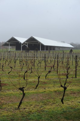
Over the holidays I visited the new Parrish Art Museum, in Mill Creek on Long Island. The museum, which opened a couple months ago, has a mind-boggling history. In 2006, Swiss architects Herzog & de Meuron unveiled their plans for a series of 30 angular, low-slung pavilions with over a dozen different roof angles. Projected construction cost came to $82 million, a good deal more than the museum’s original $65 million budget. In 2008 the Parrish appointed Terrie Sultan, formerly of Houston’s Blaffer Gallery, as its new director. Terrie asked the architects to completely rethink the entire project with a budget more in tune with the post-economic downturn economy.
To the architects’ credit, they did precisely that and made a much simpler building–one that is both more flexible and actually displays the art better. The building is not pretentious, flaccid, or in any way reflective of the “make shapes, make shapes” trend so common today. The architects created a simple, honest building, and a great example of getting the most bang for the buck. They demonstrated the fact that good design can come with modest means and is not only for the rich and profligate. Square footage dropped a small amount (from 80,000 sf as planned in 2006, to 63,000 sf actually built), and the project was completed for only $26.5 million. Amazing!
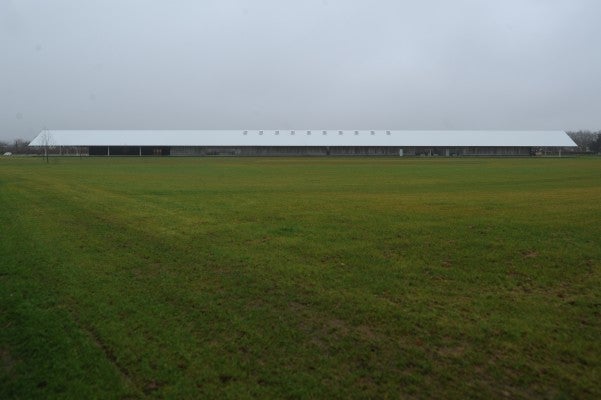
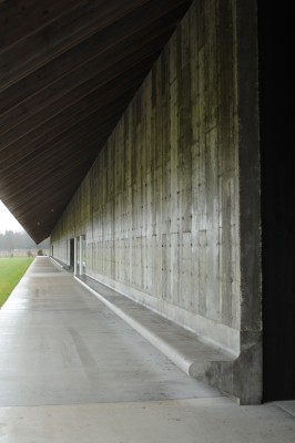
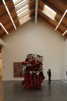
I spent the better part of a day there, and came away thoroughly impressed on all fronts. This building does just what it needs to do. It derives its form significantly from vernacular structures of eastern Long Island. The walls are made of rough, honest concrete with no fancy finishing; the material looks like what it is–big, heavy mud. Concrete was chosen both for its contribution to thermal stability and its association with the local potato barns. Very little artificial light is used as natural lighting is captured perfectly by orienting the building north-south on the site. What artificial light is used appears in the form of basic, simple fluorescent tubes. The result is gorgeous.
Some of the architectural press has called the building “stripped down” and “overly cautious” and has even suggested the architects are “just passing the time until the next great ‘fireworks’ project comes along.” I beg to differ. Pierre de Meuron has said this project helped return them to their roots (like the incredible Goetz Gallery in Munich or the Dominus Winery in Napa Valley). This is powerful, authentic architecture with no need for hype or overindulgence. It demonstrates the Eames-like talent of its designer for making simple, sensible things incredibly potent.
It’s time to make architecture that is genuine, authentic and intrinsic to the problem, and it is refreshing to see such a clear example of the “old way” given up for a “new way” of looking at architecture.
.
Hey, Larry, what an interesting project and commentary. Thank you.
Jeff Minch
.
I appreciate the formal simplicity, but I’m curious about the details and layout. I’ll have to visit someday.
Personally, I could do without the full length bench. It seems lonely and uncomfortable and also disrupts an opportunity to make a sensitive connection to the ground. The two different concretes also don’t work for me. The wall to ground relationship could be a lot better in general.
[…] Full Article […]