Architectural Record recently gave Zaha Hadid’s Guangzhou Opera House its Best Public Project: Honor Award in the Good Design Is Good Business: China competition and published it on the cover. http://archrecord.construction.com/ar_china/China_Awards/2012/Guangzhou-Opera-House/Guangzhou-Opera-House.asp
Unbelievable! I visited the building last January and was absolutely dismayed at how inept and poorly designed it is. Had anyone from the awards jury (which “included editors from Architectural Record and respected Chinese architects and experts”) actually visited the building? If so, I cannot believe they would consider it “good design.” The building’s failures are glaring and are certainly no secret. The fellow showing me around in Guangzhou did not want to take me to the opera house because he was “ashamed” of it.
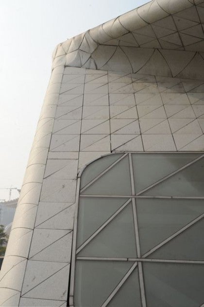
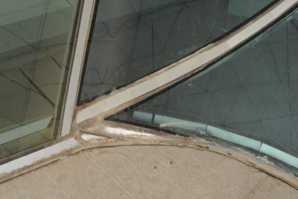
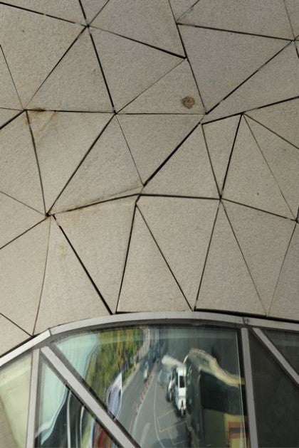
The photos in Architectural Record do look dazzling—proof again that photos can be made to lie. The images are dominated by distant views and night shots that obscure the building skin. Included here are some of my own shots, presented without the benefit of Photoshop.

If you were an arrogant westerner it would be easy to say that the embarrassing crudeness of the building is not the architect’s fault, but the result of a Chinese building industry not yet up to the visionary imagination of the designer. But that notion is belied by the fact that within view of the opera house are the extraordinary Guangzhou New Library by Nikken Sekkei, the Guangdong Museum by Rocco Design and the Guangzhou Tower by Mark Hemel and Barbara Kuit—all of which are ambitious, meticulously designed and beautifully executed. The problem at the opera house is poor design.
Is it possible to create curvilinear forms with very tight radii, superimpose a series of triangular grid patterns, make the building out of a very heavy, brittle material like granite, and realistically expect any sort of success? These seem to be ill-fated conceptual directions. When things very went badly awry, fat caulk joints apparently were the universal solution to poorly resolved design.
The interiors have the same kinds of problems—chases that seem to have been added as an afterthought, indirect lighting imbedded in sumptuous glass-fiber-reinforced gypsum forms where the faceted T-5 fixtures are clearly visible because no one checked cut off angles to be sure the lamps would be concealed.
Promoting clearly flawed design as the “best” we have to offer is demeaning and makes us look ridiculous to people outside the architecture subculture. This is how we lose power in the larger society and become marginalized as a discipline. Elevating “stars” and “signature design” at the expense of deeply rooted and rigorous standards of excellence does a disservice to our field.

Sad to see such shoddy work receive top accolade.