Technology as a Source of Beauty
In the spring of 2003 I was invited to co-teach an interdisciplinary course on “beauty” in the honors liberal arts program at University of Texas at Austin. Because I view architecture very much as an interdisciplinary field – part art, part engineering, part business, part philosophy, part sociology, part political policy, etc. – I treasure such opportunities to delve deeply into issues relevant to architecture from perspectives outside the field. This particular course involved seven faculty members – an expert in constitutional law, a mathematician, a poet, a cosmologist, a scholar of classical philosophy, an economist, and an architect.
Though there were many definitions of beauty and constructs of what is involved in creating beauty proffered in the course, one particular discussion struck me as by far the most fruitful in stipulating overarching criteria for evaluating beauty in a very wide range of fields. The discussion was led by the legal scholar of the group and focused on what created beauty in the law. He made the point that, above all, a beautiful legal argument relied on craft. 1t had to be carefully constructed, elegantly assembled, and honed with meticulous care. The interdisciplinary group embraced the notion of craft immediately as an applicable criteria for beauty in other fields. A finely crafted couplet in poetry is beautiful. A finely honed sonata in music is beautiful. A precise, refined mathematic proof is beautiful.
Our legal scholar went on to outline three components that seemed to best define craft in the context of a legal argument. First, a lean and direct economy is essential. Nothing can be superficial or extraneous. Second, there must be a rich complexity with subtlety and nuance informing every element. Third, there must be potency. The argument must make a difference, result in consequences, have an impact. Like the initial notion of craft, these three components – economy, complexity, and potency – were also endorsed by the interdisciplinary group as having real resonance and contributing fundamental beauty to our various fields. The cosmologist acknowledged that it is the economy, the simplicity, the uncontrived nature of the solar system that lends it such incontrovertible beauty. The poet defined beauty as “using all of the tools in the toolbox” – incorporating richness, texture, layering, complexity. The philosopher observed the potency of things beautiful. They make us feel, make us yearn, make us care.
Of course the architect in me delighted in these discussions. I was thrilled to hear a word like “craft,” so much a part of our lexicon as builders, deemed to be so central to the notion of beauty. It was inspiring to make the connection between the hard work of collecting, assembling, editing, and detailing and the creation of things beautiful. It reminded me how much the generation of beauty in architecture has to do with the act of making, the art of construction, the deployment of materials, the implementation of technology.
Elaine Scarry, in her recent book, On Beauty and Being Just, notes that, “though the vocabulary of beauty has been banished or driven underground in the humanities for the last two decades, it has been openly in play in those fields that aspire to have ‘truth’ as their object – math, physics, astrophysics, chemistry, biochemistry-where every day in laboratories and seminar rooms participants speak of problems… that are ‘beautiful,’ approaches that are ‘elegant,’ ‘simple.”’ Here again, the search for what is real, what is tangible, what is clear, what is incontrovertible is seen as a source of beauty. Scarry speaks of an appealing “aspiration for enduring certitude.” Is there a timeless sense of beauty that is tied to the “truths” inherent in science and technology? Is there a path to the creation of beauty that requires a constant search into what is real, honest, true in the physical world? How might this apply to architecture?
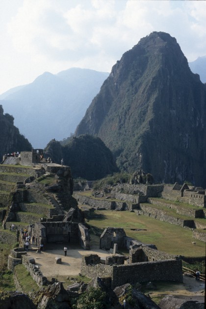
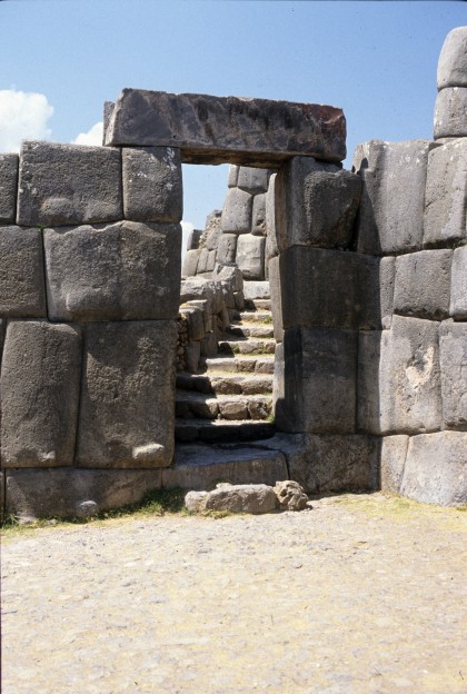
I will confess that a great deal of my own love of architecture, of my own thrill in its beauty, comes from an appreciation of elegant craft, construction, material deployment, and technology. These seem to me to be eternal verities of architecture – part of what elevates it to fine art. I am awestruck at the amazing beauty of places like Machu Piccu in Peru, where the architecture is not about exotic shapes or forms, not about fancy or pretentious materials, but rather derives an extraordinary presence simply from the art of building – of laying habitable spaces into the landscape, of quarrying stone, of stacking it up into walls and openings.
It is the craft of the architecture here that makes us awestruck. It is the technological prowess of the Inca builders, not only at Machu Piccu, but perhaps even more impressively at nearby Sachsahuaman, Oyantaitambo, and Pisac, that creates timeless beauty. The three elements mentioned earlier – economy, complexity, and potency – are certainly operative here. Formal gestures are subtle and economical, but they are also varied and complex. There is a clear, honest understanding of this particular local stone – its density, its capacity, its texture and surface. Architecture emerged here from a simple, elegant expression of technology centuries ago, but maintains a beauty and poetry that is immensely powerful for pilgrims viewing it today.
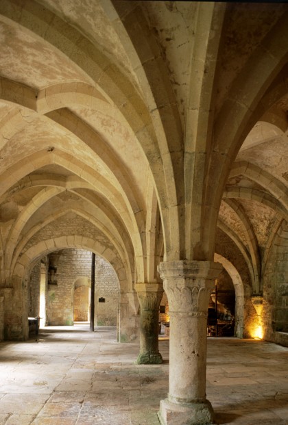
It is this kind of beauty and power that seduces me most in architecture of any era. It is the tectonic finesse and clarity of the Gothic cathedral that makes its forms and spaces so magical. It is the craft of its makers in material usage, construction, and detail that makes it so enduring. The forms of medieval piers and vaulting are so visually stunning that it is sometimes difficult to remember that their basis is technology. It is only when viewing very ordinary industrial buildings of this era like the modest forge at the Abbey of Fontenay that we realize that the origins of these forms were basic, practical construction methods. Technology is the seminal force in creating beauty.
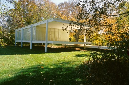
It is these same traits in modern architecture that have been equally inspiring over the last century. The economy, complexity, and potency of a small one-room building like the Farnsworth House by Mies van der Rohe is phenomenal and exquisitely beautiful. Construction becomes poetry. The simple, elegant steel frame lifted off the ground to clarify all its parts and connections is lean and direct. It is also deep, rich, and layered with interpretation. This tiny structure is solid, but also hovers. It is a frame, but also a volume. It is diminutive, but also monumental.
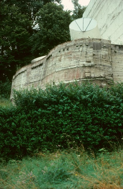
No less so, the economy, complexity, and potency of Le Corbusier’s rugged concrete fortress at La Tourette are also moving, awesome, and very beautiful. Construction here is crude and elemental. Concrete is a heavy oozing material that denies precision, reveling instead in an intrinsic rawness. The result is concurrently modern and archaic. The technology is fresh and innovative, but also ancient and very basic.
In our own work we are constantly striving to learn lessons about materials, construction, and building technology that can inform the shape, texture, space, and character of our buildings. We pride ourselves in doing thorough research into whatever material we employ. Where will the stone be quarried? How does the color change in different veins of that particular geology? What kinds of equipment does the quarry employ? Can they polish, hone, or flame-finish on-site, or is that done elsewhere? Can the strength of the stone be utilized structurally? Can it be used as a structural composite with concrete so that stone becomes formwork, finish, and structural clement? Can its thermal mass be employed to advantage? Who will lay the stone? What is the best kind of mortar joint to match the skill of the mason? How will the stone age over time? How will its moisture retention affect adjacent materials? Will it need to be cleaned or otherwise maintained?
But once the material is really known in terms of its molecular composition, its strength, its thermal qualities, its weight, its manufacture, its visual character, etc., many lessons are already apparent about design potential. It can be employed with truth and beauty or it can be applied superficially – just as visual effect. If one believes that craft is indeed important in the creation of beauty in architecture, then it is fundamental that architects must know materials, construction methods, and technologies, and use them with sincerity and mastery.
I am constantly impressed by the conscientiousness toward craft among great figures in any creative field. Outstanding clothing designers know fabrics deeply and intimately and depend on the material’s weight, weave, drape, texture, etc. to create their magic. They know how to cut, fold, hang, and seam each piece to produce the desired effect. Great photographers know various films – their speed, their saturation, their stability, their ability to capture warm or cool tones. They know lenses, shutters, apertures, filters. Above all, they know light – its density, its brightness, its slant, and its volatility.
As architects we have a daunting quantity of technology that we must master. Far more than a clothing designer or a photographer, we must be committed to continual research and education to keep ourselves abreast of both longstanding and emerging technologies. Creativity depends not only on breaking new ground with new materials and assemblies, but also on using time-tested methods skillfully and with real freshness. In both of these arenas lies the potential to create truly beautiful architecture through the employment of great craft.
THE CONCRETE HOUSE
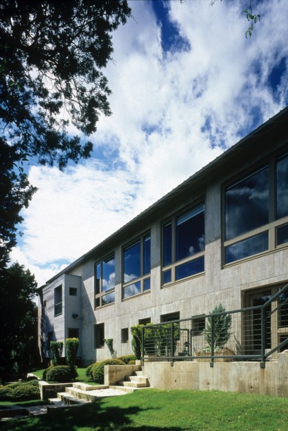
The site for this 6,000-square-foot house had one of the most spectacular views in Austin. Situated on an cast-facing hillside it captured long vistas of the Colorado River, Town Lake, downtown Austin, the Capitol Building, and the University of Texas tower. Lush vegetation shrouded the foreground so that almost no other houses intruded into the natural frame with the city beyond. But the site had a significant downside as well. It had very poor soil conditions – a deep land of expansive clay on the surface with limestone bedrock a full 30 feet below. From the start, it was clear that a massive foundation with concrete piers shielded from the expansive clays would be required.
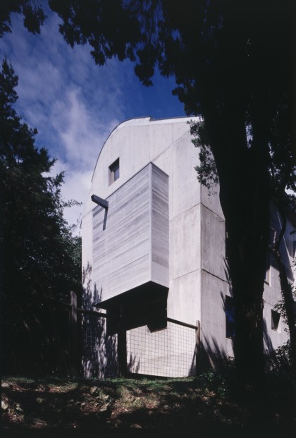
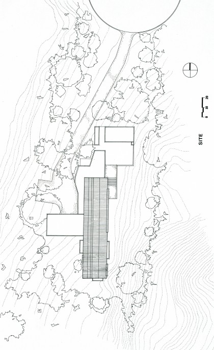
The technical challenge of counteracting the poor soil conditions of the site became a significant provocation in developing the character of the house. Because the piers were so expensive it was important to keep their number to a minimum. A simple rectangular volume for the main part of the house afforded an ideal geometry to accomplish this. In order to space the piers as far apart as possible, deep concrete beams were an obvious solution as a means to bridge between supports. But instead of thinking of the spanning members as just beams, we started to imagine them, because of their height, as walls. [n fact, it seemed to make very good sense structurally to make the whole rectangular volume out of concrete resting on a minimum number of piers carrying the loads to bedrock. A simple, elegant structural solution to the thorny soil conditions became the initial gesture for the house.
The rectangular volume was stretched long and thin to align with contours on the site requiring as little cut-and-fill and disruption of the natural topography as possible. The contours of the land naturally aligned with the view downhill so that the long east-facing side of the volume would deliver forcefully one of the chief assets of the site. The thin dimension of the rectangle was sized so as to allow a clear span of floor trusses for the lower floor, similar trusses for the upper floor, and somewhat lighter and more shapely trusses for the roof.
In order to scale down the volume somewhat and as a means to achieve some functional flexibility in plan, wood appendages were “hung” off the concrete box. Literally cantilevered in most cases, they housed the kitchen, the entry, a balcony, a bay window, and a study space off the master bedroom. The most prominent of the wooden pieces softened the narrow end of the rectangle that faced the street. The small dimension, modest scale, and gentle material on this approach side of the house combined with the presentation of most of the original site vegetation to render the house virtually invisible from the street.
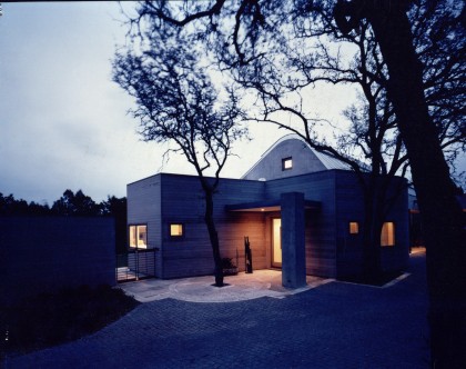
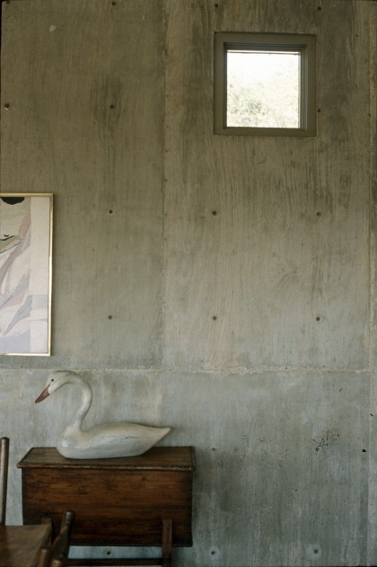
The finish of the concrete was not forced to look clean, sleek, or consistent. The intention was to revel in the intrinsically imprecise nature of the material. It was important to have “bug holes” and even modest amounts of “honeycombing.” Though care, was taken to keep form work clean and not to reuse it excessively, the texture of the plywood-even with an occasional “football”-was accepted as an appropriate reflection of the process of making. The resulting concrete finish is rich, warm, and variegated. The magic of liquid turning to stone, the heft and mass, as well as the handmade quality of the concrete, are palpable.
Both the thermal and moisture protection performance of the concrete and the process of putting it in place provided stimulating design challenges. Though any given section of the wall was produced in one pour, it was actually made up of two layers of concrete with an interstitial layer of styrofoam insulation between. The insulation was placed in the formwork between the steel reinforcing bars and held in place by metal discs while the concrete was poured around it. This resulted in an eight-inch-thick layer of concrete inside the insulation, lending remarkable thermal stability to interior spaces.
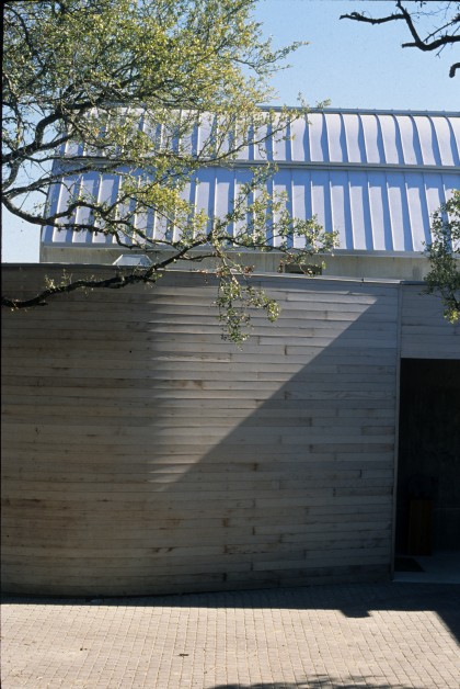
The other prominent materials of the house are used in a way that also seeks to reflect their physical properties. The wood volumes are “hung” in contrast to the firmly rooted concrete and are detailed to be light and thin. At the entry, the narrow wood siding bends to embrace a small gallery, demonstrating its greater flexibility and shape potential. The metal roof is demonstratively even more thin and bendable. It is a sleek membrane stretched over the concrete volume with contrasting precision and uniformity. All of the materials – concrete, wood, and metal – were intended to weather naturally, taking on a compatible patina of grays, buffs, taupes, and browns over time.
Inside, the generative structural approach delivers big open spaces compatible with the grand view and big sky outside. Though concrete walls can be a bit dominant if they fully enclose a small space, here they have plenty of room to breathe and feel nicely in scale with the space. The whole top level is like one big room. Even the master bedroom and bath on the south end bleed into the big living/dining spaces which occupy the rest of the floor. Bath and closet spaces are defined as pavilions floating in the larger room – their walls stopping far short of the ceiling. The master bedroom is more isolated, at the back, but is still spatially continuous at the top of the room through glass partitions.
The soft curve of the ceiling is delineated by asymmetrical bowstring trusses that gesture toward the view. The bottom chord of the trusses, which is structurally a tension member, is rendered as a thin rod of steel. The other chords are heftier wood reflecting their necessity to carry compression and bending. The articulation of each structural material – concrete, steel, wood – playing its most appropriate role and reflecting its natural, physical traits, gives an almost anthropomorphic quality to the building. We can feel the strength and heft of some parts and the thinness and delicacy of others and palpably relate them to the bones and muscles of our bodies.
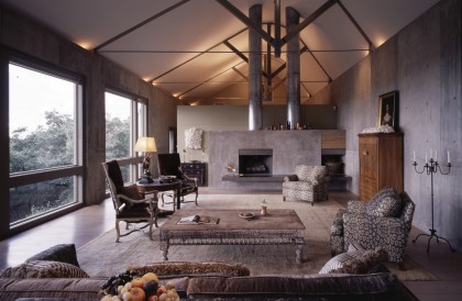
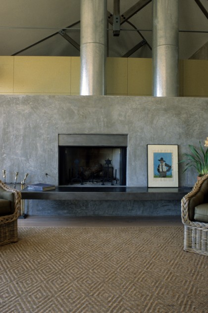
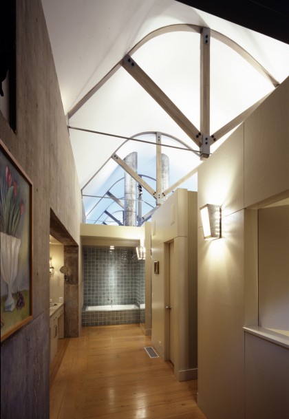
Floors in the big upper space are recycled longleaf pine. They are resawn in wide planks here after an earlier life in a warehouse in Louisiana. The rich, prominent grain of the pine gives it a strong, natural feeling that is very different from a polished hardwood floor. Cabinet work is made of painted ash, chosen because the ash grain subtly telegraphs through the painted surface. The fireplace is rendered cement – a slightly more refined version of the concrete walls. The hearth is made of steel that was sandblasted, burnished, and oiled to give it a patina like a gun barrel. Eased slightly away from the edge of the fireplace, the hearth docs not convey heat and serves as a smooth bench for extra seating in the living area.
Several wall surfaces are made of Stramit, a very “green” material made from wheat stalks. Disposing of the refuse of wheat production is a big problem in Texas – especially with a ban on burning in many areas. The Stramit recycles this waste material by heating it under pressure until the natural glutens in the straw fuse the material together. The Concrete House used some of the very first sheets of Stramit produced in Texas by an experimental operation in the Texas Panhandle. The Stramit is layered together like butcher-block to produce a richly textured, honey-colored surface.
It has been fascinating to see the house embrace the eclectic set of possessions its owners have brought into it. A very wide range of art-from Old Masters to Jasper Johns – has graced the walls and looked remarkably at ease on them. The concrete has enough neutrality so as not to compete with art, but enough presence and tactility to place the art in a context that is real rather than self-effacing.
There is a powerful sense of craft in the Concrete House. It amply meets the three criteria set out by my law colleague. There is a rawness and economy in the house. It is not fussy or overwrought. It is simple and direct. There is also a complexity here. The dialogue between different materials and between the character of the materials, the character of the site, the character of the spaces within is layered and multifaceted. There are traces all over the house of how it was made, lending an extra richness of meaning. This is, as well, a house with real potency. It is a quiet house with a robust presence, a muscular house with genuine delicacy. Visitors walk away with vivid memories and striking impressions.
The beauty here comes from an exploration of craft and technology. It is not a sentimental or nostalgic beauty, but one rooted in a tactile, vivid experience of life. This beauty is like that of the bark of a tree or the fur of a car (which both, after all, reflect their technological role). It is not about style or fashion, and it shouldn’t need to be “understood.” It is meant to just be palpable – able to be absorbed through the senses.
WABASH PARKING GARAGE
It is perhaps perverse to even discuss beauty in the context of a building type so mundane as a parking garage. On the other hand, maybe finding (or making) beauty in the most humble of situations is really the significant challenge architects commonly face. Seldom does a client come to an architect wanting them simply to produce beauty. The agenda is substantially (and appropriately) to make a house to live in or an office building to work in or a school to learn in. The creation of beauty is generally several lines down on the list of wants, if it is there at all. The creation of beauty must be implicit in every project an architect approaches, and our means of creating beauty must be intrinsic in accomplishing other goals. That is why mining technology as a source of beauty can be so fruitful – even in a parking garage.
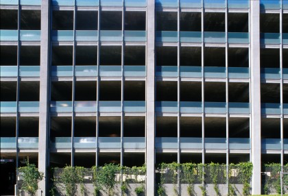
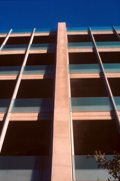
A parking garage is a wonderfully basic building type. It possesses very singular technology and very singular function. The Wabash Parking Garage accepts the very fundamental nature of itself as a building. It is made of five parts – a robust concrete frame, a delicate lightweight metal armature, translucent glass infill panels, open stairways, and a copper-clad elevator core. Each clement is rendered clearly and explicitly in its own role and then married to the other parts as appropriate.
The concrete frame is made up of vertical piers and post-tensioned horizontal beams of the same width and about the same depth as the piers so that they work together visually as a system. The piers are turned with their long dimension perpendicular to the building for lateral stiffness and sit proud of the rest of the structure. Flat slabs span between the beams and are turned up at the perimeter to create curbs. A line marking the thickness of the slab itself telegraphs through as a reveal on the perimeter surface. Piers, beams, slabs, and curbs are articulated as individual, straightforward functional elements but are tied together by their common material-concrete.
A lightweight galvanized steel armature runs vertically between the piers and parallel to them, subdividing the short bays into three parts and the long bays into four parts. The armature is made of double steel angles bolted to each other and, in turn, bolted back into the concrete frame. The steel is clearly not meant to carry building loads, as it is hung off the structure itself. The armature is made denser at the bottom of the building and on the back by the addition of a metal trellis attached to the double angles. This trellis provides security as well as a framework on which jasmine vines are growing.
Galvanized metal clips attach the translucent glass panels to the steel armature. The glass is laminated with a milky film between the two layers giving it a rich luminous quality. It is set out a few inches from the concrete slab and straddles the slab and the opening above. This gives each piece of glass two distinctly different colors and different levels of light transmission. The glass has a slightly green tint which is more intense when there is a void behind it and has a more milky quality when it is backed by concrete. Its shimmery edges catch glints of light in the sun. The glass, which is an unusual material for a parking garage allows maximum natural daylighting for the interior, fulfills guardrail requirements, functions as a visual screen for cars, and breaks down the utilitarian scale of the concrete structure.
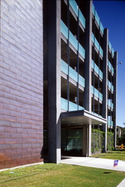
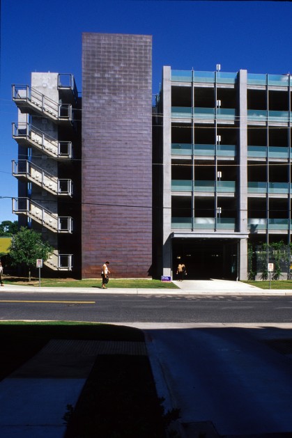
Open stairways at two diagonal corners celebrate their difference in scale and geometry from the rest of the structure. With steps cantilevered off a central pier, they are dynamic and even jittery in comparison to the quiet regularity of the rest of the structure. Their pleasantness and sense of security encourages people to use them for vertical circulation rather than the elevators, adding another layer of animation. With simple cable rails and minimal enclosure, they capture views and breezes in every direction.
The elevator core anchors the building and marks its primary pedestrian entry and exit point. Sheathed in copper shingles with a rich, warm patina, this tall slender shaft is clearly all about vertical movement. Beside it, a cantilevered awning sheathed in galvanized metal with a clean, flush soffit marks the entry and provides shelter for shuttle users. Horizontal panels of the milky glass loosely define a pleasant outdoor lobby below it.
Lighting was a design issue dealt with thoroughly in this garage. Because strong light could have intruded upon the surrounding neighborhood, primary lighting is indirect – shining up onto the flat slabs and bouncing down into the spaces below. A bit of supplemental light at the perimeter of the building is provided by a series of small utility fixtures placed just inside the translucent glass. They light the edge of the building gently without flooding the area, and give a bit of sparkle to the building façade at night.
Though it had very low construction costs (less than a standard precast parking garage), this is a well-crafted building. It satisfies the criteria of economy, complexity, and potency. It is lean and simple, yet its assembly of clearly defined parts gives it richness and multiple readings. It is a striking object and has become something of a landmark on the heavily traveled street where it is located.
ADDITION TO SETON MEDICAL CENTER
Expressing the physical, technological properties of materials like concrete, stone, steel, or wood has, perhaps, a more obvious architectural manifestation than the expression of the qualities of a less tangible building material like glass. Often glass is used in buildings simply to create a void rather than to emphasize the inherent properties of the material itself.
Since the 1970s I have been haunted by Paul Scheerbart’s little 1914 book Glasarchitektur, in which he extols the technological and aesthetic potential of glass to create new architectural possibilities. An original copy of the book from its first printing resides in the Humanities Research Center at University of Texas at Austin. The old and delicate appearance of the little text coupled with its progressive ideas that still seem fresh and new make a powerful impression. For Scheerbart, glass had a strong physicality with variable texture, thickness, color, light transmission, and even structural capacity. He was fascinated by emerging glass technologies of his era, and was enthralled by future potentials he could conceive for its application.
The material which is described with such passion in Glasarchitektur was imagined, even in its simplest application, as being configured in multiple layers with light between the layers. Scheerbart imagined “light columns” made of “light elements behind a completely glass surround” which would “not give the impression supporting.” He envisioned such glass architecture would acquire “an almost floating quality.”
When we were called upon to add a large surgery center to an existing 1970s brick hospital with a rather heavy, dour visage, Scheerbart’s ecstatic lightness came to mind. Part of the scope of the project was to create a new entry, a new chapel, and a new “front door” image for the whole hospital which would give a more positive, progressive impression. The aesthetic quality of glass and light used together offered the potential to create a sense of precision and technological sophistication alongside a certain softness and illusiveness. These were deemed appropriate for a building where modern medicine is concurrently dealing with both scientific exactness and human frailty and vulnerability.
As a functional device, a long thin volume faced with glass was strung along the north side of the new surgery center to bring light deep into rooms, which had to be below grade. The translucent glass draws in bright, cheerful light without sacrificing visual privacy for the recovery rooms inside. At night the glass volume is lit from within lending a safe, glowing presence to the medical center where activity occurs around the clock.
Though tied visually to the original hospital by low brick walls and by shared rhythms and proportions, the new building offers a bold new image for the medical center. It employs a serious investigation of glass technology to create a rich evocative beauty.
AUSTIN CONVENTION CENTER EXPANSION
Just eight years after the original 400,000-square-foot Austin Convention Center was completed, the success of the facility demanded a doubling in size. Though the original scheme had anticipated expansion, the site reserved for growth was only about half the size of the original site and was intended to accommodate only half as many square feet as the initial building. The necessity to make the expansion twice as dense as the existing structure required a fundamental rethinking of the original scheme, though there was a strong desire to create a seamless whole (not an old and a new building) in the end.
There was still a very firm commitment, as well, to the urban design intentions of the original building. It was clearly important to maintain not only the variety and legibility of streetscape of the 1992 building, but also to retain its scale, which had been drawn from the best parts of nearby Congress Avenue and historic Sixth Street. This would be challenging given the much denser, and necessarily much taller, new building.
As in the original project, the loading area was located on the back side of the site, nearer the interstate highway and away from the action of downtown. The “big box” of the exhibition hall was placed in the center of the site, away from the important street edges. It was ringed with smaller, more active functions – lobbies, registration areas, and prefunction spaces, as well as stairways and escalators – addressing the street. Unlike the original building, a second layer was stacked on top of both the exhibition spaces and some of the peripheral areas. This level contained a 45,000-square-foot ballroom, extensive meeting room suites, and the lobbies and prefunction spaces required for them. The scale of the expansion from street level is kept similar to the original building by stepping the upper floor back, especially along the Trinity Street façade, in order to reduce its bulk. That provided the opportunity to create generous terraces off all upstairs prefunction spaces which have excellent views of downtown.
Another significant difference in the façade treatment between the two phases lies in the response of the peripheral elements to their varied surroundings. The first building was faceted on one edge to respond to the shape of the creek and was made partly of rough-faced limestone to match the character of the creek bed. The new building is firmly within the downtown grid, has great views of the skyline in two directions, and has a long face with north light available. It is, therefore, cleaner, crisper, lighter, brighter, and more open than the original.
Because expansion was anticipated to the north, the last element on that edge of the Trinity Street façade was made of an anodized aluminum skin – a material that could be easily matched later to provide a seamless transition between old and new. The joint between the two was originally intended to be a void which would be the terminus of Third Street looking east. (This would provide an interesting counterpoint to the iconic pavilion with its polygonal window which terminated the more active Second Street.) The void would be flanked by aluminum-faced volumes on either side – one old and one new. When the much larger program needed to be accommodated, footprint space became very precious, and it was not possible to leave a void. Instead, a large stair tower was placed between the metal pavilions and was faced in a very delicate woven stainless steel mesh. Because this treatment is so transparent and mysterious, the façade almost becomes a void, fulfilling the original intention.
Trinity Street, which is the “green finger” pedestrian link between Town Lake a block to the south and the Sixth Street Entertainment District two blocks to the north, has a somewhat tighter building façade along its edge than Fourth Street, which borders the site to the north. The Fourth Street façade is bolder in scale facing historic Brush Square (one of the four original public squares in the 1839 plan of the city) and a new high-rise convention hotel. Its grander “civic” scale acknowledges, as well, the future role of Fourth Street as the city’s major east/west transit corridor. At the corner of Trinity and Fourth streets is an elegant glass pavilion which creates a new “front door” for the entire complex. Its presence on this very visible corner, anchoring Brush Square, establishes a powerful landmark for the convention center in the downtown fabric. The pavilion contains a single space 90 feet tall, 62 feet wide, and 142 feet long which serves as a critical vertical link between exhibition halls on the ground floor and ballroom/meeting room spaces above.
In this pavilion the notion of technology as a source of beauty is particularly apparent. Both inside and outside the art and the craft of building are explored in every surface and detail. It is the “jewel” of the complex with views from all over the building on both levels terminating in its light, airy volume. It is a powerful orientation device in a large, complex building as well as a prestigious venue for receptions and other significant occasions. It is important that it be beautiful. Rising through the dramatic space is a striking escalator with its two legs joined by a landing that cantilevers out through the west façade. The escalator turns 160 degrees at the landing to ascend its full 54-foot height at the prefunction space outside the upper-level ballroom. The escalator ride provides a vertical promenade through the space and through the city with spectacular views of the skyline and the Hill Country landscape beyond. At night the pavilion becomes a beacon for the convention center with the soft light reflected off its angular ceiling providing a warm glow through its crystalline façade.
From an urban design point of view, from considerations of orientation and function, from an experiential point of view and in terms of daylighting performance, it was critical that this strategic corner pavilion be as transparent as possible. Addressing one of the most important open spaces in the city, the building’s long north façade gave a rare opportunity for openness without compromising thermal performance. The technologies developed here came as a means to promote transparency in an extraordinary way – one that would dramatically reinforce broader design intentions.
The outside “wall” of the pavilion is actually a ten-foot-wide zone which deals interdependently with structure and enclosure. The structure needed to be kept as slender as possible in the direction of the view and yet, because of its great height, with no intermediate floors for bracing, it had to exercise some means of achieving stiffness. Within the ten-foot zone are a series of eccentrically proportioned piers (long and very thin), a five-foot-wide gap (filled with cable and rod bracing), and a curtainwall (literally hung from the roof) made of shingled glass. The piers, the gap, and the curtainwall cooperate to carry gravity loads, resist lateral loads, create a thermal and moisture barrier, diffuse natural light, and provide an extraordinary transparency in the direction of the view.
The piers are made up of three components. The lower 18 feet of each pier is a reinforced concrete shaft 16 inches wide and four feet deep. The center 60 feet is a slender steel box column six inches wide and 30 inches deep. The top 12 feet consists of a “tree” made of four solid steel bars three inches in diameter arranged in an inverted pyramid. The composite pier is an elegant essay on the forces and potential inherent at each stage along the pier’s length and the capabilities of steel and concrete in various configurations to deal with those forces.
The glass curtainwall minimizes the size of structural supports required by reducing compressive stress and compressive buckling. Vertical structural members are kept in tension by hanging the façade from the roof beams which are ten-foot-on-center atop the steel “trees.” T-shaped hangers drop 72 feet from each beam with long slender blades-3/4-inch by 18 inches-facing outward. The glass is placed so as to slope against the depth of the blades in 12-foot tiers creating a shingled effect. The portion of the blades outside the glass becomes an elegant saw-tooth fin of varying depth. Between the Ts, horizontal members eight inches wide and four inches tall on 12-foot vertical centers create supports for the five-foot by 12-foot, one-inch-thick glass panels. (The horizontal members also transfer wind loads from the curtainwall back to the box column via the aforementioned struts and cables.) Each glass panel is made of two layers of low-emissivity glass with a ceramic frit on the inside of one sheet to improve thermal performance and reduce glare.
The “tour-de-force” of the pavilion is a large glass screen wall on its west face. Though most of the surface of the pavilion needs no special sun protection because it faces north and is made of high performance glass, the glazing on the west required special attention. The glass screen provides sun shading, but it also becomes a piece of glass sculpture and a solar energy farm. A series of vertical panels with photovoltaic cells faces southwest to capture maximum exposure for solar collection and to filter the sun during the hottest part of the day. A series of cobalt blue panels with an acid etched surface faces due west and contribute color and animation while further reducing heat and glare on the interior. The structure supporting the glass screen is a mirror image of the pier structure of the pavilion. Both piers and screen project 12 feet above the pavilion to fully block the summer trajectory of the sun.
Design of the pavilion was a collaborative effort involving many consultants as well as the architectural team. James Carpenter, a glass sculptor, contributed his artistry on the west screen wall. Matt King, an engineer with Ove Arup Partners consulted on structural frame concepts. Chuck Naeve and his firm, Architectural Engineers Collaborative, elaborated and executed the structural design. Davidson Norris consulted on daylighting and glass selection. Ann Kale contributed to the lighting design. Beck Steel fabricated and erected the primary structure. Win-Con installed the glazing. Austin Energy funded and assisted with design of the phorovoltaics. Many others were involved in fundamental ways as well.
The technology and the craft that was achieved collaboratively here at a high level of sophistication reflects the same three qualities observed in other projects-economy, complexity, and potency. The spidery delicacy of the structure represents an effort to use the very smallest quantities of steel to perform any given task. The minimalist quality of the struts, cables, and “trees,” in particular, represents an extraordinary thrift and efficiency. It is almost by magic that they do their job. An elegant aesthetic economy pervades the whole space – from structure to glass to wall treatments to handrails.
A rich complexity likewise permeates the place. The intricate combination of parts is inextricably linked into a coherent whole. Structure and enclosure are individually articulated, but interdependent. A constant dialogue is struck between issues of construction, light, view, thermal performance, and functional accommodation. Urban demands and interior needs codetermine shapes, forms, and spatial qualities. Everything is interrelated.
The result is a strong sense of place, a real architectural potency. This is a landmark object in the city and a jaw-dropping room inside. It introduces a series of spaces on the interior of the convention center that range from yeoman to ethereal depending on their role. (Exhibition Halls are workhorses. The sexy “light blades” in one reception hall are hummingbirds.) But this front door pavilion is the powerful glue that holds the whole together.
The beauty here is intricate and fascinating – like the works of a watch or the pattern of dew on a spider’s web. There is something sure and inevitable about it, but also an element of quirkiness and individuality. There are no precious materials like marble or rosewood or gold leaf – sometimes associated with beauty. But there is a fineness that comes from an investment of human attention to thinking, conceiving, and making.
Featured In
Design Awards
- Austin Commercial Real Estate Award
- Associated Builders & Contractors Excellence Award
- Associated General Contractors Building Of The Year
- Austin Chapter AIA Honor Award
- Texas Society Of Architects Design Award
- Austin Chapter AIA Honor Award
- Traditional Home Design Award
- Texas Society Of Architects Design Award
- Austin Chapter AIA Honor Award
- Modern Healthcare Design Award
- Society Of American Registered Architects Design Award