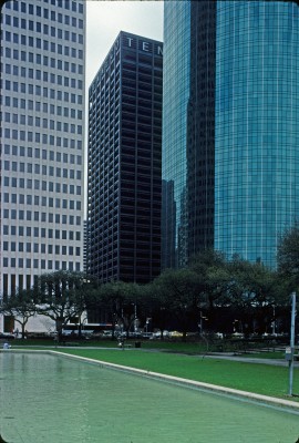
Tenneco Building
A few blocks from the Tenneco Building in downtown Houston sits the modest little Kellum-Noble House of 1851. Simple, clean, taut, and undecorated, the house is an elegant and unaffected response to mid-nineteenth-century residential needs. Its simple, squarish plan yields plain but flexible interior spaces. The deep double-decker porch that surrounds it on all four sides shields it from the hot Texas sun and also gives rhythm, grace, and deep shadow to enliven the building’s volume. Highly revered and carefully preserved, the building has never been a flashy showpiece – rather a gentle, dignified building with great integrity and presence.
These are the virtues of the Tenneco Building as well. It is not a “blockbuster” or even an eye-grabber. It has never been a “dazzler” on the Houston skyline – not even before it was shrouded by so many taller neighbors. It is rather a sophisticated, carefully crafted representative of its ubiquitous building type. It is the finest of a genre of Modern office buildings that sprouted on Texas skylines in the decades following World War II.
Modernism is a style that began under the aegis of utilitarianism. It lauded economy of means and promoted a taste for simplicity, seeking “prudent” solutions to “problems” of its day. In the case of the Modern office building it sought to optimize – to produce maximum efficiency, maximum return on investments’ minimum maintenance and operational costs, etc. But it also sought to be expressive – especially expressive of its rationality.

A key concern in the aesthetic of the Modern office building was articulation – articulation of space, articulation of structure, articulation of systems. The building was intended to explain itself to the rational viewer by means of often subtle distinctions and detail. Since real estate-based formulas often dictated the size and shape of the building, the architects’ efforts became focused on surface and structure. The period produced endless variations on the theme of the skin and bones of a building.
Skidmore, Owings, and Merrill, architects for the Tenneco Building, were the most prolific designers of major office structures of the era. The firm, comprised of over one thousand architects, engineers, and technicians in the heyday of Modernism, had three regional offices in New York, Chicago, and San Francisco. Although virtually all SOM work in the 1960s bore an identifiable “firm stamp,” there were also significant differences among works of the regional offices. These differences can be seen in three office towers in Houston built over a ten-year span from 1961 to 1971 – the First City National Bank by SOM/ New York, the Tenneco Building by SOM/San Francisco, and One Shell Plaza by SOM/Chicago.
Characteristic of the work of the New York office, the First City National Bank of 1961 is the most abstract of the three buildings. It is an unadorned white structural cage with columns and beams of similar dimension creating a flush external grid. The glass wall is set back a few feet so that the cage stands free and clear. The building does not look “engineered” or even “built” and has a scaleless, unemotional quality. Characteristic of the work of the Chicago office of SOM, One Shell Plaza of 1971 is the most structurally innovative of the three towers. It was, at the time of its construction, the tallest reinforced concrete building in the world. Its “tube within a tube” structural system marked it as one of a handful of SOM projects of the time that broke away from standard cage construction. The “muscular” articulation of its exterior tube gives the building a tough structural integrity.
The Tenneco Building by SOM/San Francisco lies between the other two towers in philosophy as well as in physical location and time. Like the First City National Bank, Tenneco is a structural cage with recessed glass walls. Here, however, the cage is not abstract but carefully articulated to distinguish its parts and their various roles.
Columns are pulled slightly forward from the beams, accentuating a vertical line. Horizontal sun shades are clearly “hung” from structural beams above them. Dark “amber grey” aluminum cladding gives the cage a strong, tangible feel. Like One Shell Plaza, the building exudes a sense of structural integrity, but at Tenneco the expression is not “over-engineered” to the point that it seems more effort than the problem requires.
Tenneco’s most dramatic formal gesture is to the streets which surround it. A deep three-story-high arcade is recessed into the building at the bottom to provide shaded “mini-plazas” on three sides and shelter for a drive-through bank on the fourth. A two-story interior banking facility is suspended in the arcade by means of bars in the curtain wall. The scale of the arcade is majestic – the proportion of the suspended element intensifying that scale by the contrast of low and high spaces.
The strength and simplicity of the Tenneco Building make it seem at home in Texas. It is not prissy or overly refined, but rather earthy and robust in a sophisticated way. The pervasive Texas pink granite paving on its ground level and its sensible use of sun shading throughout further tie it to its place. It is a consummate example of the Modern office tower sensitively and appropriately regionalized to Texas.