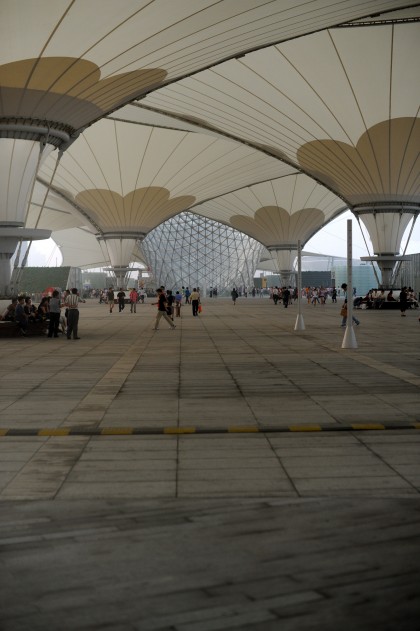
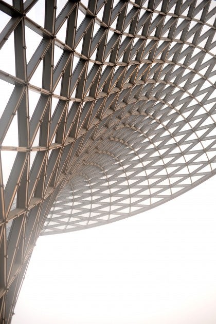
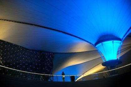
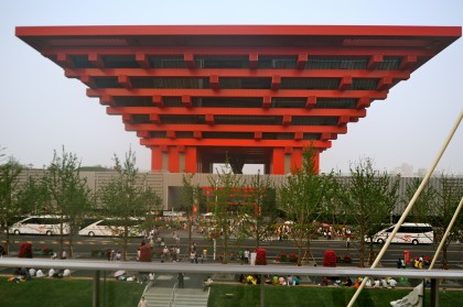
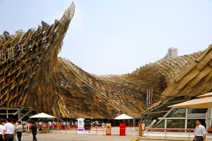
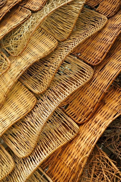
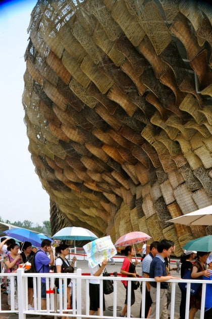
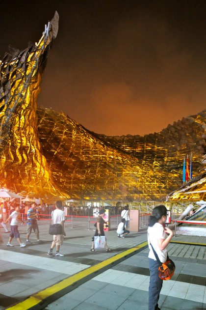
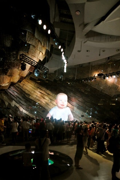

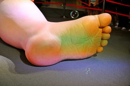
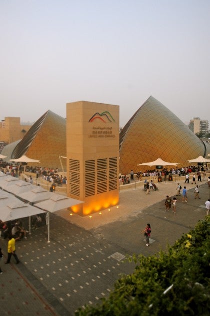
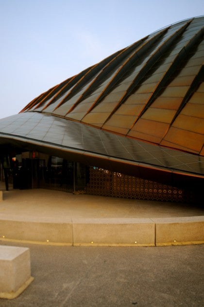
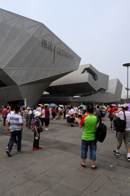
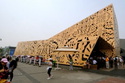
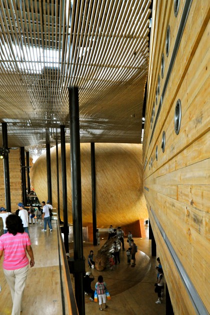
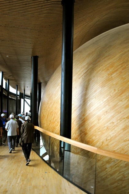
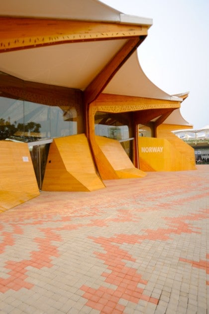
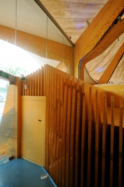
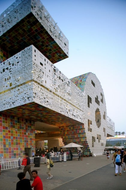
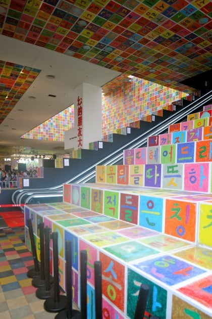
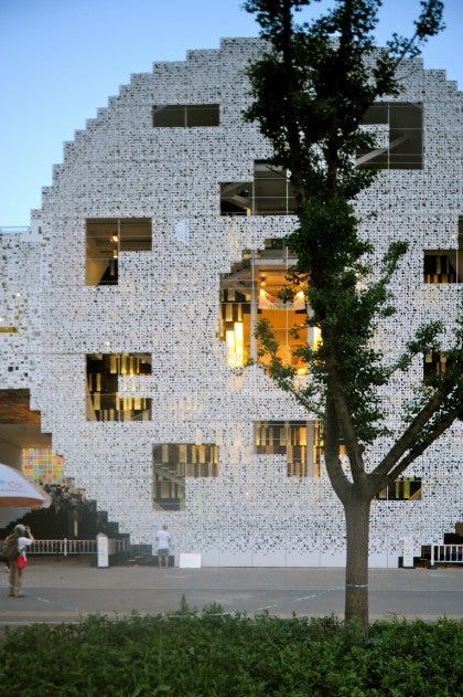
The architecture of World’s Fairs in general ranges from exquisite (e.g. Mies Barcelona Pavilion, Le Corbusier’s L’Esprit Nouveau Pavilion, Aalto’s Finnish Pavilion at the 1939 New York World’s Fair) to just flashy and eye-catching with very little sophistication. There was a lot of attention grabbing excess at Shanghai and occasionally some real quality. I was most impressed when there was a powerful effect achieved with simple means–like the basket skin in Spain;s pavilion or the simple exterior and rich interior of Chile’s pavilion.
All in all, I feel like I am at an architectural petting zoo at these World’s Fairs. Every exotic entry stands alone. Each pavilion is muscling out its neighbor in a effort to be the star attraction. At Shanghai, architecture seemed to be the major medium for individual expression. The exhibits seemed to take a back seat to the buildings, and were often pretty boring.
It was a bit dismaying to see how trendy the architecture tended to be in a lot of cases. There were a lot of warmed-over versions of shapes, forms and materials you see around a lot. The real invention or authentic expression of message was pretty rare.
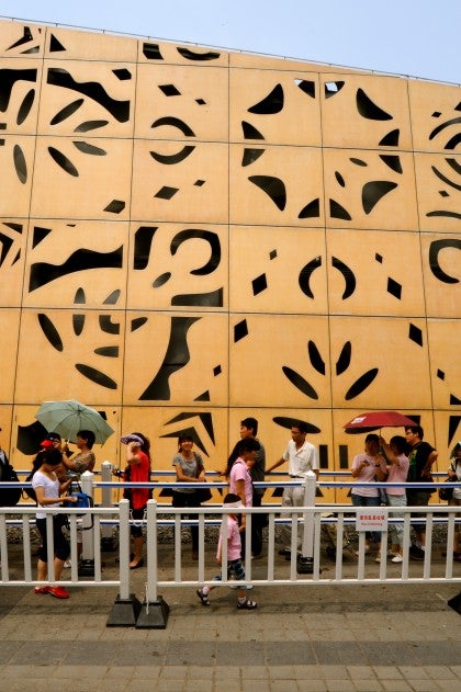
The best exhibits in the fair were the crowds. They were fantastic to watch. The overwhelming majority of people there (I heard numbers from 95% to 99%) were Chinese tourists from all over the country. They had their parasols to protect against the potent sun during the day and mobbed the place until late into the night. They seemed endlessly patient (waiting in line for up to 5 hours for some pavilions), wondrously curious and genuinely proud to have hosted such a great show.